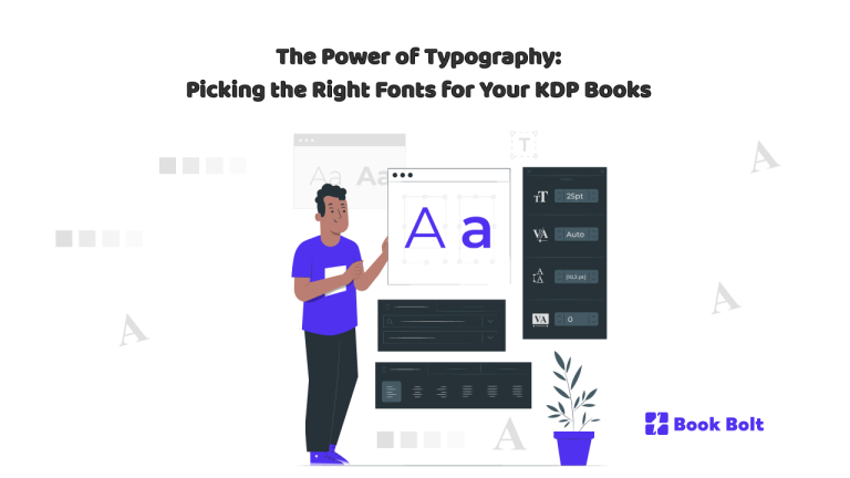
Typography might seem like a subtle design choice, but in the world of self-publishing—especially in the low- and no-content space—it can be the difference between a book that gets clicked on and one that gets scrolled past. Whether you’re designing a gratitude journal, a kids’ handwriting workbook, or a spiritual planner, the right font choices can immediately communicate your book’s niche, tone, and professionalism. On Amazon KDP, where users judge a book in mere seconds, typography isn’t just a design decision—it’s a marketing tool.
In this in-depth guide, we’ll explore the impact of typography on KDP books, how to make effective font choices for covers and interiors, and how to leverage BookBolt’s suite of tools to design visually compelling books that resonate with buyers.
Why Typography Matters in Low- and No-Content Publishing
Fonts aren’t just letters—they’re voice, personality, and promise.
For example:
- A horror-themed journal using a whimsical font like Comic Sans is a mismatch that confuses the shopper.
- A kids’ handwriting workbook using a script font that’s hard to read will turn off buyers instantly.
- A minimalist planner with overly ornate serif fonts can feel visually cluttered and overwhelming.
Typography influences:
- First impressions (e.g., does this look like a professionally made book?)
- Audience appeal (e.g., is this book for kids, professionals, creatives?)
- Functionality (e.g., is the font easy to read or write within?)
- Brand consistency across a KDP catalog
The Fundamentals of Great Font Choice
Before jumping into the tools and tactics, let’s get familiar with some best practices.
1. Clarity Over Style
Always prioritize legibility. Especially in interiors where people are writing or working (journals, workbooks, logs), the font must be clear and readable at smaller sizes.
2. Match the Mood
Fonts have emotional weight. A bubbly rounded sans-serif feels youthful and fun, while a sleek modern serif feels sophisticated. Pick fonts that speak to your audience’s expectations.
3. Keep It Cohesive
Choose one or two fonts and stick to them across the book (cover and interior). Mixing too many fonts creates visual chaos.
4. Size Matters
Headers should be large enough to stand out but not overwhelm. Body text should be comfortable to read and not crammed. As a rule:
- Header fonts: 18–26 pt
- Body fonts: 11–14 pt
- Writing prompts: 12–16 pt with ample line spacing
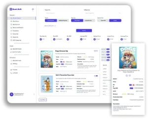
Using BookBolt to Master Typography
BookBolt Studio provides an easy, drag-and-drop interface for designing both book covers and interiors. Its native tools allow you to integrate and manipulate fonts with precision and creativity—no need for external design software.
Font Features in BookBolt Studio
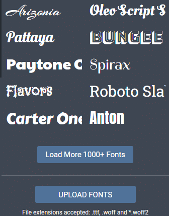
- Pre-loaded fonts: Choose from dozens of fonts optimized for publishing
- Font sizing and styling: Adjust point size, spacing, bold, italics, underline
- Alignment tools: Ensure headers and text blocks are centered or grid-aligned
- Text layering: Overlay text onto design elements or images
- Transparency control: Create stylish effects while maintaining readability
- Upload custom fonts (Pro Tip!): If you have a favorite licensed font, upload it into your BookBolt Studio dashboard for use in both covers and interiors
BookBolt’s tools let you preview your designs in real time, ensuring your fonts are both aesthetically pleasing and practical.
Cover Fonts: First Impressions Matter
The cover is the billboard for your book. Fonts must be both eye-catching and on-brand.
Best Practices for Cover Typography:
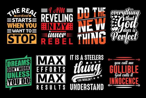
- Use bold, high-contrast fonts to stand out in thumbnail views
- Avoid thin or delicate fonts that disappear in small sizes
- Match genre expectations (e.g., script fonts for wedding planners, blocky fonts for fitness logs)
- Don’t overcrowd—2 font families maximum on a cover
Examples by Niche:
- Gratitude Journals: Elegant script fonts like Alex Brush or Playfair Display
- Fitness Planners: Bold sans-serifs like Montserrat or Impact
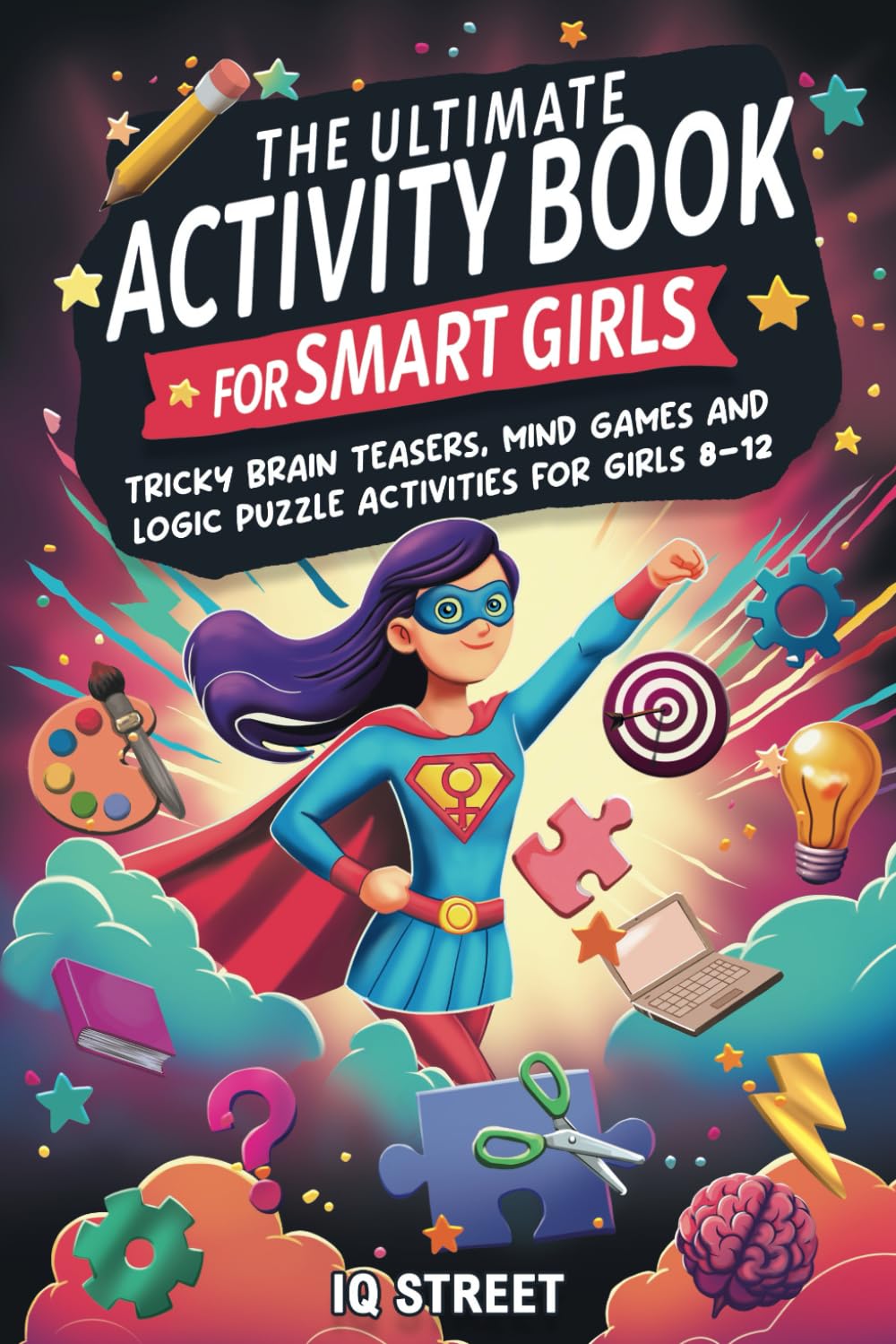
- Kids’ Activity Books: Fun rounded fonts like Comic Neue or Baloo 2
- Spiritual Journals: Classic serif fonts like Lora or Noto Serif
Interior Typography: Where Form Meets Function
While your cover gets the click, your interior gets the sale. Shoppers often preview a few interior pages before buying.
Functional Fonts for Interiors:
- Choose fonts that are:
- Easy to read
- Appropriately spaced
- Consistent across pages
Examples:
- Prompt Journals: Use a clean serif like Georgia or a sans-serif like Lato
- Activity Books: Use display fonts for section titles, and legible fonts like Poppins for instructions
- Handwriting Workbooks: Use dotted or dashed fonts for tracing letters
BookBolt’s Interior Generator lets you create and customize templates with your own text prompts, which means you have full control over your interior font layout. Whether it’s for a self-care journal or a dream log, you can modify the font family, size, and alignment right inside the platform.
Font Pairing Basics
Combining fonts can elevate your book’s design if done carefully.
Font Pairing Rules of Thumb:
- Pair a serif and a sans-serif (e.g., Playfair Display + Open Sans)
- Pair a decorative font for headers with a neutral font for body
- Avoid using fonts that are too similar—it defeats the purpose
Bonus: Font Pairing Cheat Sheet
Here’s a ready-to-use cheat sheet of font pairings by book type:
| Book Type | Header Font | Body Font |
|---|---|---|
| Gratitude Journal | Playfair Display | Lato |
| Wedding Planner | Great Vibes | Quicksand |
| Kids’ Activity Book | Baloo 2 | Comic Neue |
| Fitness Tracker | Montserrat Bold | Roboto |
| Spiritual Journal | Libre Baskerville | Noto Serif |
| Business Planner | Bebas Neue | Open Sans |
Use this chart as a starting point. All of these are available in BookBolt Studio or can be uploaded.
Licensing Your Fonts
If you’re using BookBolt’s built-in fonts, you’re safe. But if you upload custom fonts, be sure to verify their licensing:
- Google Fonts: Free for commercial use
- Creative Market or Envato: Check the license terms
- Free font sites: Beware—“free” often doesn’t mean “free for commercial use”
Always err on the side of caution and maintain a folder of license files for every custom font you use.
Common Font Mistakes to Avoid
Using too many fonts
Ignoring contrast (especially over busy backgrounds)
Using decorative fonts for body text
Forgetting to test readability at small sizes
Inconsistent font use between cover and interior
Test your book design on multiple devices and in BookBolt’s preview modes to ensure your fonts translate well across formats.
Optimizing Typography for Specific Niches
Here’s how font psychology plays out in different book categories:
Kids’ Workbooks:
- Use big, bubbly, and legible fonts
- Stick with sans-serifs for clarity
- Avoid cursive unless for tracing purposes
Mindfulness & Self-Care:
- Soothing script headers and clean body fonts
- Use light colors and generous line spacing
Business & Productivity:
- Strong, clean lines (e.g., Bebas Neue, Roboto)
- Minimalist layouts, no-frills fonts
Creative Prompts:
- Fun or artistic fonts for titles
- Clean fonts for guidance text
All of this can be implemented inside BookBolt Studio using its text and layout tools.
Conclusion: Let Fonts Do the Heavy Lifting
Typography isn’t just about making your book look good—it’s about creating a better product, building trust with buyers, and strengthening your brand identity. In the crowded KDP marketplace, it can set your book apart, encourage conversions, and turn first-time buyers into repeat customers.
With BookBolt Studio, you have everything you need to test, tweak, and finalize your fonts—from cover to interior. Paired with smart keyword research and niche targeting, your typography choices become part of a complete publishing strategy.