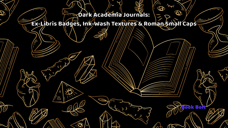
Dark Academia never really went away; it refined itself. The 2026 flavor is calmer and typographic: Roman small caps, archival textures, and quiet page systems. That pairs perfectly with KDP’s standard B&W interiors because clarity and contrast read well both at thumbnail and in hand. This guide shows you how to build Dark Academia reading-log journals that look at home on a walnut shelf—using KDP-safe choices throughout—and how to assemble them efficiently with BookBolt.
We’ll focus on three pillars (all interior-safe in grayscale):
- Ex-libris badges (ownership labels & library ephemera)
- Ink-wash /paper-grain textures (subtle, grayscale-friendly)
- Reading-log interiors (adult-useful, legible)
You’ll get palettes (for covers only), type systems, cover frameworks, interior templates, BookBolt workflows, copy blocks, and a production SOP—all compliant with KDP print reality.
1) Why Dark Academia journals still sell
- Identity + mood: Signals bookish culture without shouting—quiet, intentional, timeless.
- Giftability: Neutral aesthetics + practical interiors (reading logs, quotes pages, commonplace spreads).
- Thumbnail clarity: Serif headlines, small-cap labels, strong borders = legible at tiny sizes.
- Scalable system: One badge + one serif/sans pairing can power a full line (lined, dot grid, reading log, quote journal, study notes, research notebook)—all with B&W interiors.
2) Visual language: build the DA “kit”
Palettes (for covers only; interiors remain B&W)
Keep saturation modest; push value contrast.
- Stacks & Stacks: bone, soot, oxblood, bottle green, brass accent.
- Ash & Ivy: ash, ink, ivy, tea cream, maroon accent.
- Conservatory Night: moon, midnight, lichen, plum, antique gold.
KDP reality: Color belongs on the cover. Interiors print B&W on white or cream paper (standard). Design every interior graphic as grayscale with solid contrast.
Typography
- Display serif: Old-style or transitional (e.g., Garamond/Caslon or licensed equivalents). Set SMALL CAPS for headings and labels (use true small caps or carefully tracked caps).
- Support sans: Neutral grotesk for tables, page numbers, and labels.
- Figures: Lining numerals for tables; oldstyle numerals can be nice in headings.
- Ornaments: Hairline rules, fleurons, §, tiny bullets—sparingly.
Rule of two: one serif + one sans. DA is restraint, not a type buffet.
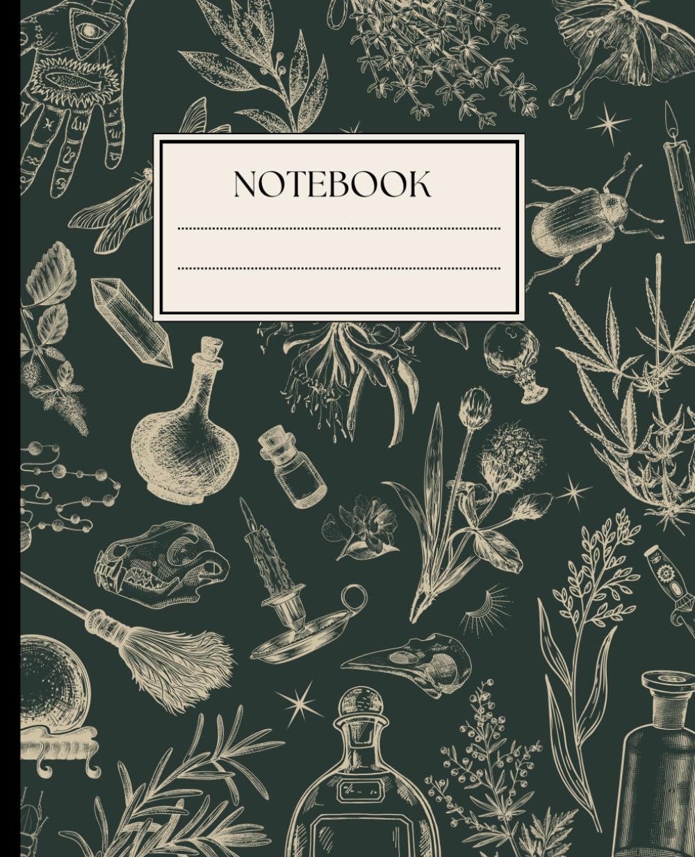
Iconography (interior-safe)
- Ex-libris emblems: open book, laurel, inkwell, quill, owl, torch, lyre, acanthus, armillary—kept as single-color vector shapes that hold up in B&W.
- Library ephemera: spine labels, date-due stamps, accession numbers—use as micro-labels, strictly grayscale.
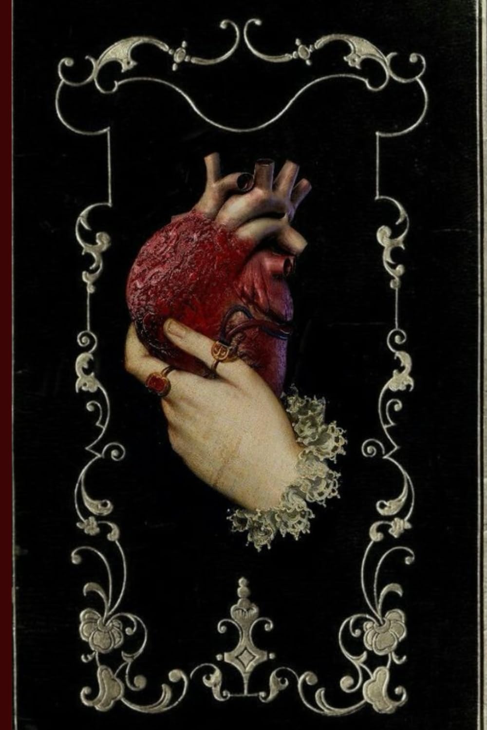
3) Ex-libris badges: the centerpiece
Goal: make the journal feel like a kept object—without relying on color.
Shapes: oval cameo, cartouche rectangle, shield, circular seal.
Contents: “EX • LIBRIS” top; central emblem (owl/inkwell); bottom “THIS BOOK BELONGS TO” + ruled line.
Microtype: “Plate No. IV • Private Collection” or “Accession 2026.”
Contrast: Outline (near black), mid-tone fill (40–60% gray), paper (white/cream stock).
Cover usage (color OK):
- Place a badge on a textured field or framed layout. Keep titles large and crisp.
Interior usage (B&W only):
- First page after title: large ex-libris plate (grayscale).
- Optional: tiny badge in footers of reading-log spreads for a unifying detail.
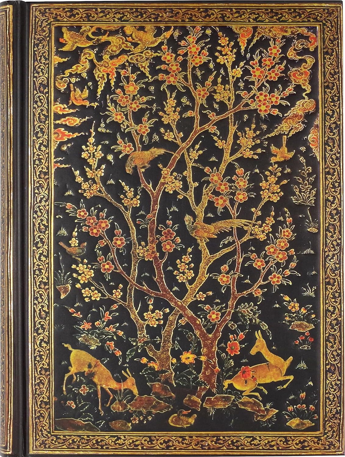
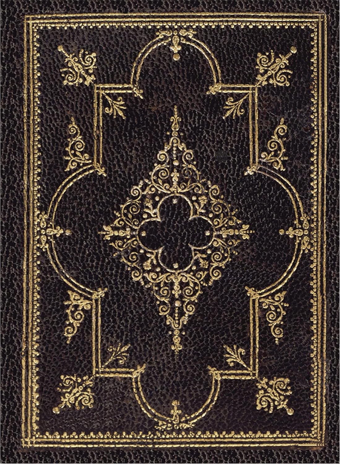
4) Ink-wash & paper-grain textures (no “endpapers” required)
Traditional marbling screams “library,” but KDP paperbacks don’t support true endpapers. Instead, simulate the vibe with grayscale ink-wash or subtle paper-grain textures where appropriate.
- Style (interior): low-contrast ink-wash or scanned paper grain; avoid busy patterns that mush in B&W.
- Placement (interior): restrained header/stripe bands, divider pages, or background tints set very light (keep text 100% black).
- Covers: feel free to use color marbling/linen effects; just ensure the title remains dominant.
Print reality: Avoid delicate gradients. Add 1–2% noise to large soft areas to reduce banding; keep line weights ≥ 0.75–1 pt.
5) Reading-log interiors adults actually use (B&W)
Design for real life—clear tables, ample line spacing, and room to think.
Core spread (two pages):
Left page — Entry Table
- Title ▢ Author ▢ Start Date ▢ Finish Date ▢ Format (Print/Audio/E-book) ▢ Pages ▢ Rating (□ □ □ □ □)
- 6–8 rows per page (generous leading; not a receipt).
Right page — Notes & Passages
- 2–3 ruled blocks labeled Notes, Quotations (optional faint quotation mark watermark kept light), Themes / Characters.
- Footer mini-index lines: Tag: ________ and Shelf: ________ (e.g., Classics, SFF, TBR).
Optional inserts (still B&W):
- Year in Books: 12 mini boxes (Jan–Dec) with tally marks.
- Favourite Passages: a few pages with wider ruling and a small grayscale ornament.
- TBR: simple table (Title / Author / Source / Priority □).
- DNF Reasons (gentle): not for me, wrong season, pacing, topic shift—checkboxes.
Typesetting notes:
- Leading: 125–140% of text size.
- Margins: larger inner gutter (paperback); keep folios away from the spine.
- Rules: 0.75–1 pt; better to lighten color than thin the stroke.
- Page numbers: centered footer or outer corner; small caps allowed.
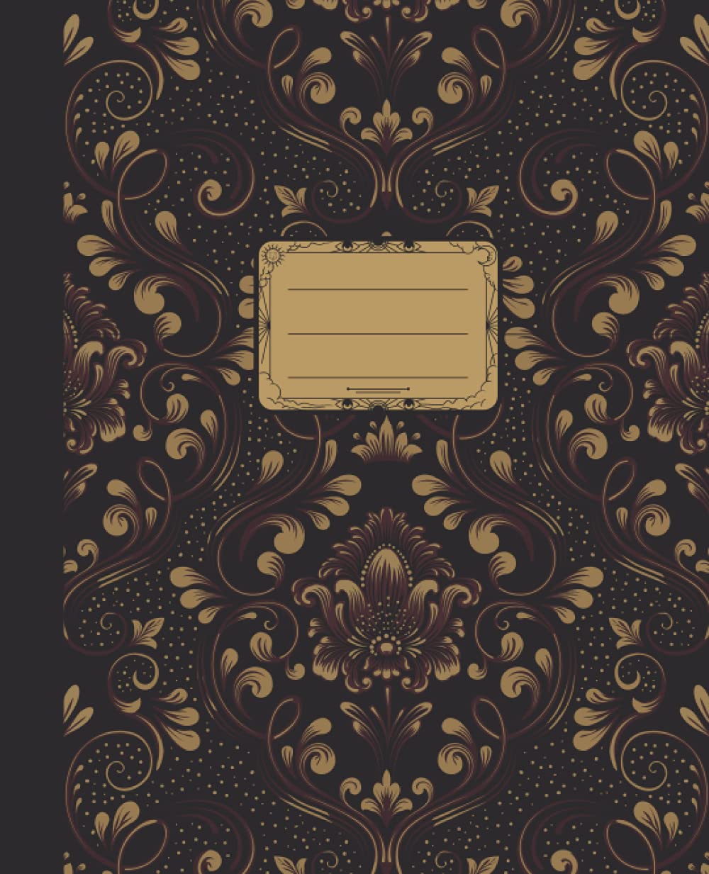
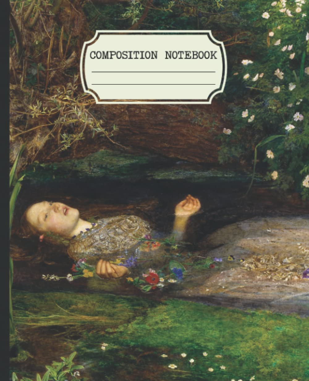
6) Cover frameworks (win the thumbnail—color allowed)
A) Single Badge on Texture
- Background: linen or marble (color OK on cover).
- Center badge with emblem; title in ROMAN SMALL CAPS inside the badge.
B) Linen Field + “Spine Label” Graphic
- Printed rectangle “label” on the left third (graphic only—not an actual spine label).
- Title set large and high-contrast.
C) Heritage Frame
- Solid bone field; double-line border with tiny corner ornaments.
- Title stack: small-cap serif → thin rule → small grotesk subtitle.
D) Conservatory Night
- Midnight field; brass line frame; laurel coin accent.
- Reversed title in bone, generous letterspacing.
Back cover: keep it crisp, with a short blurb and clear space for the barcode (no clutter).
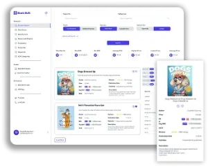
7) BookBolt workflow (light touch, high leverage)
Step 1: Keyword Recon (5–10 min)
Seed: “dark academia journal”, “reading log for adults”, “ex libris journal”, “book review log”, “library reading journal”, “book club notebook”. Note monthly volume, related phrases, common trim sizes (e.g., 6×9, 8.5×11), and page counts.
Step 2: Competition Gaps (5–10 min)
Look for illegible titles, busy covers, missing ownership plates, and palette gaps your designs can fill.
Step 3: Interior Designer (20–30 min)
Build the Entry Table (left) + Notes & Passages (right). Add Year in Books and TBR inserts every 20–30 spreads as dividers.
Export no-bleed PDF, B&W, with correct gutter.
Step 4: Cover Mockups (30–40 min)
Design 2–3 directions. Keep titles big. Check at 100% zoom and as a tiny 200–300 px thumbnail.
Step 5: Listing Craft (10–15 min)
Write a clean title (no soup), bullets with outcomes + features, and a clear description.
8) Complete interior recipe (ready to replicate)
- Trim: 6×9 in (portable) or 8.5×11 in (roomy)—both standard on KDP.
- Pages: 144–160 (enough for a year without bulk).
- Bleed: No-bleed (safest for ruled/table layouts).
Front matter (4–6 pages):
- Title page (small caps + tiny ornament)
- Ex-libris ownership plate (full page, grayscale)
- How to use this journal (short)
- Year in Books (1–2 pages)
Body:
- 60–70 reading-log spreads (left table, right notes)
- Insert a TBR page every ~20 entries
- Favourite Passages section (6–10 pages) near the back
Back matter (2–4 pages):
- Index (lined; user-filled)
- Optional Lending log (Title / Borrower / Date Out / Date Back) for a library nod
9) Listing copy blocks (paste-ready, KDP-safe)
Title (example):
Dark Academia Reading Log Journal — Vintage Ex-Libris Bookplate, Roman Small Caps — 6×9, 150 Pages (B&W Interior)
Subtitle (optional):
A classic reading companion to track titles, authors, dates, ratings, and favorite passages.
Bullets:
- Ex-libris ownership page with vintage badge (fill in your name).
- Reading-log spreads: table for Title/Author/Start/Finish/Format/Pages/Rating + lined notes and quotations.
- Calm Dark Academia look with Roman small caps and archival-style ornaments (B&W interior).
- Year-in-Books & TBR inserts to keep your reading life organized.
- Thoughtful margins and legible type designed for everyday use.
Description snippet:
A quietly elegant reading companion inspired by library stacks and classic bookplates. Subtle grayscale textures, Roman small caps, and useful tables make this as functional as it is beautiful—built for readers, students, teachers, and book-club friends.
10) Three capsule variations to expand your line (all interior B&W)
- Ex-Libris Classic
- Bone cover, central badge, large serif title. Interior identical; swap subtle cover accents (brass vs. bottle green).
- Conservatory Night
- Midnight cover with brass frame and small badge; reversed title.
- Add a few Favourite Passages pages with wider ruling (still B&W).
- Scholarly Linen
- Linen texture field + printed “spine label” graphic.
- Include Lending Log and Bookshop Wishlist pages in the interior.
Each capsule: 2–3 covers × 2 trims (6×9, 8.5×11) × 120/150/180 pages → a cohesive shelf without re-engineering interiors.
11) Production SOP (KDP reality checklist)
- Fonts: one licensed old-style serif + one neutral sans; embed fonts; avoid faux small caps.
- Paper: white or cream interior (standard); B&W ink only.
- Margins: mind the gutter; keep folios and tables away from the spine.
- Rules/lines: ≥ 0.75–1 pt; test a print proof when possible.
- Textures: grayscale only; add 1–2% noise to soften gradients.
- Color usage: Cover only; keep title contrast strong for thumbnails.
- Files: interiors as PDF (no bleed unless required), correct trim; cover per KDP template at 300 dpi.
- No special finishes: no foil, emboss/deboss, spot varnish, or true endpapers on KDP paperbacks.
- Naming: da_readinglog_exlibris_6x9_150p_interior.pdf, da_readinglog_conservatorynight_cover.pdf.
12) Quick A/B tests
- Badge size: large central vs. small “spine-label” graphic.
- Title wording: “Reading Log Journal” vs. “Library Reading Journal” vs. “Book Review Log.”
- Back-cover callout: “Year in Books” vs. “Favourite Passages.”
Run 2–3 weeks; keep winners, sunset the rest.
13) Common mistakes (fast fixes)
- Color-dependent interior art → Convert to grayscale with strong contrast; remove color-only cues.
- Over-busy textures → Reduce density/contrast; float a solid badge so the title reads.
- Fussy fonts → Two-font max; increase tracking on small caps.
- Micro tables → Fewer rows, more leading; adults need room to write.
- Vanishing lines → Move to 0.75–1 pt; lighten color instead of thinning.
- No gutter allowance → Widen inner margins; move folios outward.
- Keyword soup → Clear primary phrase + 1–2 specifics (size/page count). Put the rest in bullets/description.
In conclusion
Dark Academia for KDP isn’t about moody clip-art or heavy color marbling. It’s discipline: a strong ex-libris badge, Roman small caps, and an actually-useful reading-log interior—all in crisp B&W—will carry your book farther than trendy noise. Use BookBolt to validate keywords, build interiors quickly, and write clean listings—then let your design craft do the selling.