Still Feel Fresh
(A design guide for KDP creators — color on the cover, black-and-white interiors done right)
Mid-century modern never really left—it just keeps strolling back in with a wink. Optimistic colors, easy curves, cheerful geometry, and the belief that everyday objects can be both useful and beautiful. If you’ve ever felt joy at a starburst clock or a boomerang-edge coffee table, you already understand the feeling. Translating that onto a KDP-printed notebook cover is simple once you know where the look came from and what makes it sing.
This is both love letter and field guide—less about “pushing pixels,” more about why this look works, how to channel it into print-on-demand journals and planners that feel authentically mid-century (and stay within Amazon’s printing realities).
The Spirit of the Era
From the late 1940s through the 1960s, optimism buzzed through homes, diners, airports, and classrooms. Materials became friendly: plywood bent into shell chairs, aluminum and fiberglass turned sculptural, textiles played with repeats. Modernism softened—form met function with wit instead of ornament.
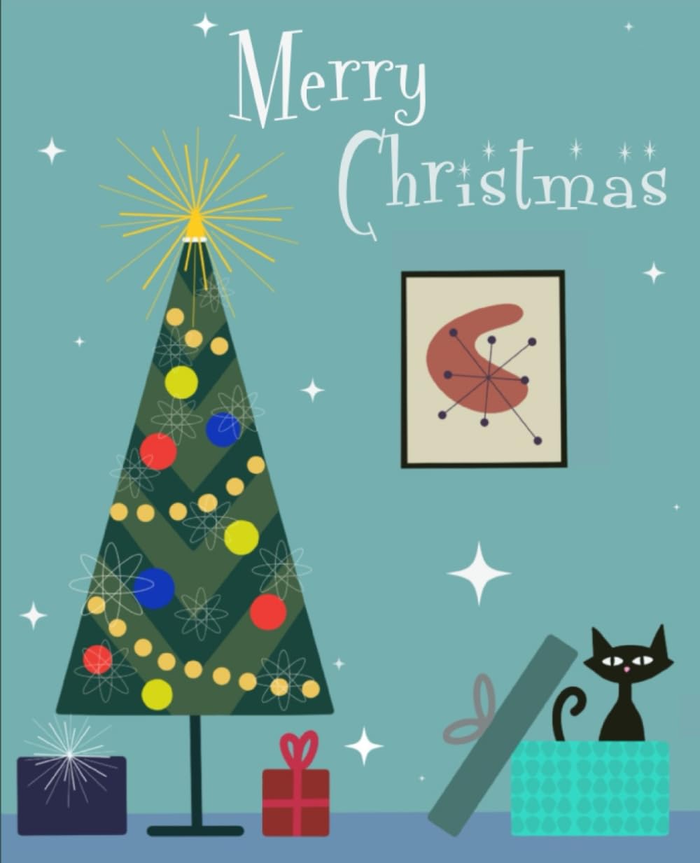
The jet age and atomic era shaped it too: constellation starbursts on wallpaper, orbital rings on dishes, boomerang shapes across countertops, furniture that looked ready to lift off. Technology felt hopeful—and human.
Where You’ve Seen It
- Roadside diners & cafés: chrome trim, spark icons, boomerang tabletops.
- Bowling alleys: conical lights, curved numerals, cartoon mascots.
- Googie architecture: upswept roofs and rocket-like signage.
- Airline posters: blocky color fields, breezy sans-serif type.
- Schools & civic spaces: terrazzo floors, arrowed wayfinding, friendly geometry.
That’s your visual pantry. When designing notebooks, imagine a student in 1962 sliding a spiral into a locker or a traveler jotting notes at the TWA terminal. You’re designing for that world—the optimism of tomorrow, softened by friendly shapes.
The Mid-Century Vocabulary (Spotter’s Guide)
1) Shapes
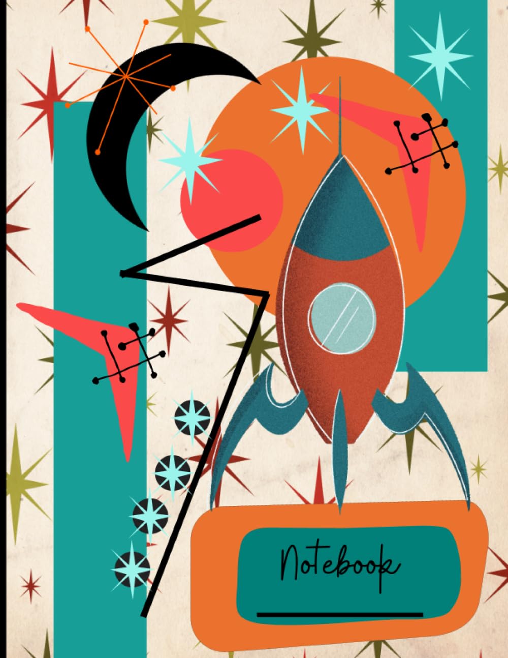
- Boomerangs: curved swoops with tapered ends.
- Starbursts: radiating lines—graphic exclamation points.
- Kidney blobs: soft rectangles with one concave edge—perfect for title fields.
- Atomic orbits: dotted rings—science made friendly.
- Hairpins & ticks: quick accent strokes—visual rhythm.
2) Lines
Confident, consistent, and airy. Even hand-drawn lines stay smooth and unfussy. Negative space matters—let designs breathe.
3) Patterns
- Repeats that breathe: scattered stars, relaxed grids, generous spacing.
- Textural quiet: linen-like weaves or paper speckle textures—created in grayscale for KDP interiors.
Print reality: KDP interiors are black-and-white only. For texture, simulate tone with gray values or fine stipple patterns; avoid subtle gradients that may band or blur.
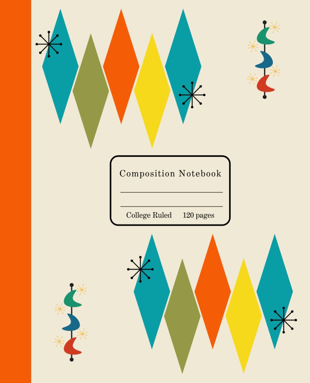
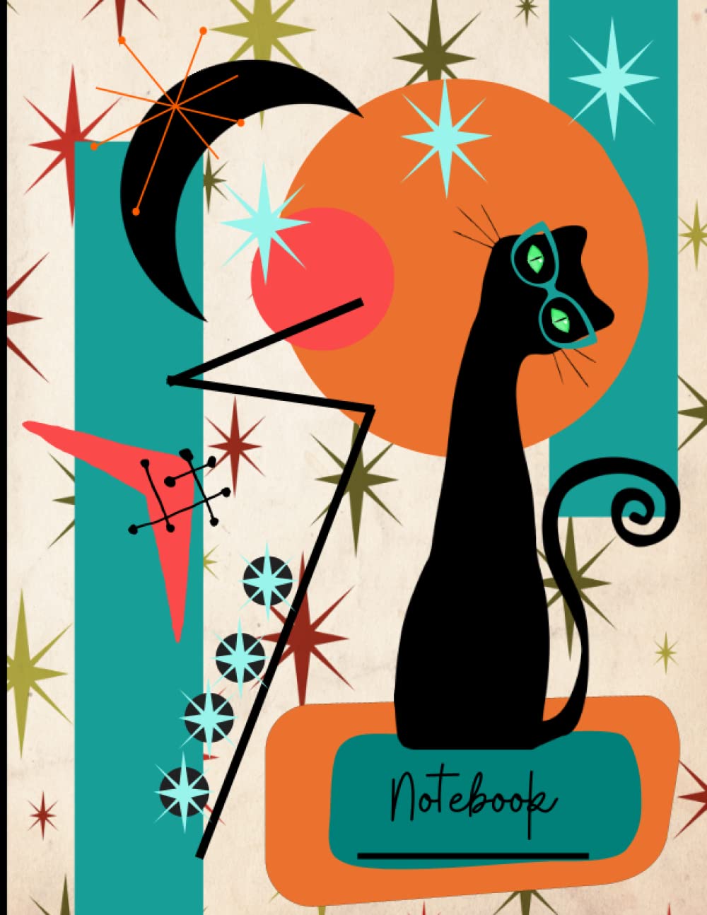
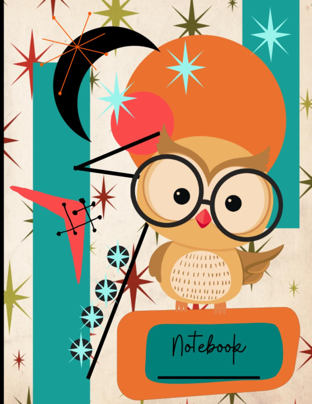
Color, the Mid-Century Way (for Covers Only)
KDP paperback covers support full color—so this is where the jazz palette lives. Keep the interiors grayscale.
Palette moods (for cover use):
- Palm Springs Pop: mustard, pool-teal, persimmon, bone, charcoal.
- Radio Console: walnut, pistachio, cream, petrol blue, coral.
- Atomic Diner: avocado, cherry, mint, cool gray, sky blue.
- Aviation Lounge: slate, cognac, parchment, navy, butter.
Key: one dark anchor, one light field, two to three mid-tones. Stay cheerful, not neon.
Type That Belongs
Mid-century typography balances engineered precision and human warmth.
- Geometric sans-serifs: clean circles and stems—great for uppercase titles.
- Humanist serifs: add literary weight.
- Scripts: one playful word only, not full headlines.
- Generous tracking: let letters breathe.
Readable, clear, and friendly—just like the era itself.
How the Aesthetic Behaves on a Notebook
- Poster-like covers: a few bold shapes; one clear focal idea.
- One motif per cover: hero first, accents second.
- Use white space: silence between notes.
- Interiors stay calm: ruled, dot, or grid layouts in grayscale only. Add small motifs—tiny starburst at header, maybe a minimalist label—but no colored ink or pattern backgrounds.
KDP note: Interiors print in black ink on white or cream paper. Keep rules and dots between 0.75–1 pt and medium gray (≈70–80% black) for visibility without harshness.
Inspiration Sources
When you’re stuck, raid history’s junk drawer:
- Diners: bright counter meets soft mint booth—echo with one bright accent over a calm field.
- Bowling alleys: ghosted numerals, playful stripes.
- Airports: labeled rectangles, directional arrows.
- Motels: slanted signage, streaking starbursts.
- Kitchens: boomerang laminates, textile repeats.
Borrow the logic—strong shapes, clean type, limited color—not literal nostalgia.
Why It Still Works (and Why It Sells)
- Optimism: cheerful but sophisticated.
- Order: clean lines imply usability.
- Broad appeal: nostalgia + minimalism crossover.
- Thumbnail power: simple shapes read instantly.
Common Missteps (and Some Fixes)
- Too many motifs: pick one hero shape + two accents.
- Neon overload: tone down; mid-century color was tempered.
- Crowded type: loosen spacing; let titles breathe.
- Fake aging: avoid heavy distress; light paper-grain in grayscale is enough.
A Few Sold Archetypes (for Your Next Series)
- Roadside Coffee Stop
Bone field, tilted persimmon badge, teal arrow, small starburst tip. Title in relaxed all-caps sans. - Bowling League Night
Slate background, ghosted cream numerals, red boomerang, mint dots. Title in rounded rectangle label. - Jet-Age Gate
Navy field, brass orbit lines, butter title plate, single white spark. - Formica Kitchen
Parchment base, faint avocado and sky blue kidney shapes, title in walnut label. - Hi-Fi Evening
Petrol blue, stacked rectangles in cognac and cream, one bright starburst highlight.
Each theme can host lined, dot, or graph interiors—all grayscale—with minimal changes.
Interiors That Complement the Cover
Mid-century interiors behave politely.
- Lined pages: tiny starburst or label at header.
- Dot grid: dots in soft gray.
- Graph paper: darker fifth lines for structure.
Add a small “Subject” or “Date” label—nostalgic but clean. Keep margins generous and text contrast high.
Glossary (for fun)
- Googie: the tilted, rocket-age roadside architecture.
- Starburst: radiant icon symbolizing sparkle or optimism.
- Boomerang: playful swoop motif of the era.
- Kidney Table: asymmetrical biomorphic furniture shape.
- Atomic: shorthand for the science-happy optimism of mid-century design.
The Takeaway
Mid-century modern isn’t costume—it’s clarity and charm. It believed design could improve daily life, just like a good notebook does. When you use boomerangs and starbursts, you’re reviving that optimism.
Keep the cover colorful, the interior monochrome, the lines confident, and the type readable. Let your design breathe like a roadside sign at dusk—and your pages stay calm and kind.
Do that, and your notebooks won’t just look mid-century. They’ll feel mid-century: the soft promise of a better day, bound in paper and ready for whatever you write next.