Brutalist grids, mono numerals, and the quiet swagger of black-and-white design
Most gym logbooks look like they were designed by a spreadsheet after a sleepless night: lines everywhere, fonts arguing with each other, clip-art dumbbells wobbling in the corners. They technically work—but they don’t invite ritual. And that’s the irony: strength training itself is visually elegant. Barbell geometry. Symmetric plates. Chalk dust settling like snowfall. A good logbook should inherit that elegance.
If you’re building a KDP gym logbook, think like an industrial designer, not an app designer. Brutalist clarity. Honest structure. Heavy lines where they matter. Negative space that feels like a breath before a lift. Mono or tabular numerals that line up like plates on a bar. The result isn’t “minimal for minimal’s sake.” It’s a book that feels serious, usable, and quietly cool—something a lifter is proud to open between sets.
This is a studio tour of that aesthetic: where it comes from, where you’ve seen it, and how to translate it into pages that actually work—bench/squat/deadlift tables, accessory grids, RPE scales, PR archives, and meet-week layouts—without turning the book into a tiny-font control panel.
Brutalism, translated for training
Architectural brutalism wasn’t about being harsh; it came from béton brut—raw concrete. The buildings told the truth about what they were made of. No disguises, no lace. In graphic design, brutalism does the same: show the structure. Don’t apologize for it. Let beams look like beams.
Weight rooms are already brutalist environments. Steel uprights. Rubber flooring. Platforms. Tape on the floor that doesn’t pretend to be art—it says “stand here.” That’s why a brutalist logbook feels at home near a belt, a chalk bag, and a shaker. The page becomes a platform: load-bearing, readable, built to be used under fatigue.
Where you’ve seen the look (even if you didn’t name it)
Your mood board is everywhere in strength culture:
- Competition scoreboards and attempt cards: huge numerals, clean lanes, no ornament—visibility under pressure.
- Industrial wayfinding: warehouse arrows, tool labels, safety signage—function first, confidence baked in.
- Old-school strength posters: black ink on off-white paper, thick rules, type meant to survive a stapler and a decade of sun.
- Racks, plates, and track lanes: repetition and measurement as a visual language—grids made physical.
Brutalist design isn’t “cold.” It’s disciplined. And discipline is the emotional core of training.
The interior palette: black, white, and the courage to stop there
For KDP interiors, this aesthetic shines because it’s monochrome by design. Black ink, white (or bone) paper, maybe a light gray equivalent for secondary guides. That’s it.
Why this works in real life:
- Legibility in rough lighting: fluorescent gym lights and early mornings are not kind to faint details.
- Pencil and pen compatibility: lifters use whatever’s in the bag; the page should welcome all of it.
- Photocopy resilience: if someone wants extra copies of a favorite tracking page, clean contrast holds up.
- No visual fatigue: a page that “performs” drains attention; a page that serves returns it.
If you want an accent, keep it on the cover—one intentional stripe, one badge, one strong block. The interior stays focused.
Typography: mono numerals and the dignity of a blocky sans
If the page is your platform, type is your knurling—the texture that gives grip.
Use two typographic voices:
- Labels/headings: a strong, utilitarian sans (industrial grotesk energy).
- Numbers: monospaced or tabular numerals so columns align cleanly.
Alignment isn’t just pretty. It reduces cognitive load when you’re tired. When “135” sits directly above “125” and below “145,” your eyes stop working and start reading. That matters after set four. It matters in a peak cycle. It matters when you flip back months later hunting a pattern.
A practical note: keep tiny text truly readable. Brutalism isn’t micro-type. Brutalism is the confidence to make the important things big.
The three pillars: lines, grids, and white space
A brutalist logbook lives or dies on three fundamentals:
1) Lines are beams
Use thickness deliberately: heavy for section dividers, medium for borders, lighter for writing guides. The hierarchy should be felt instantly.
2) Grids are platforms
Choose a grid logic and stick to it—squares or structured columns. Consistency is what makes a system feel “serious.”
3) White space is breath
Between sets, you pause. Between sections, the page should pause too. Empty isn’t wasted—it’s usable. If you can’t write in the box with a blunt pencil while winded, the design failed.
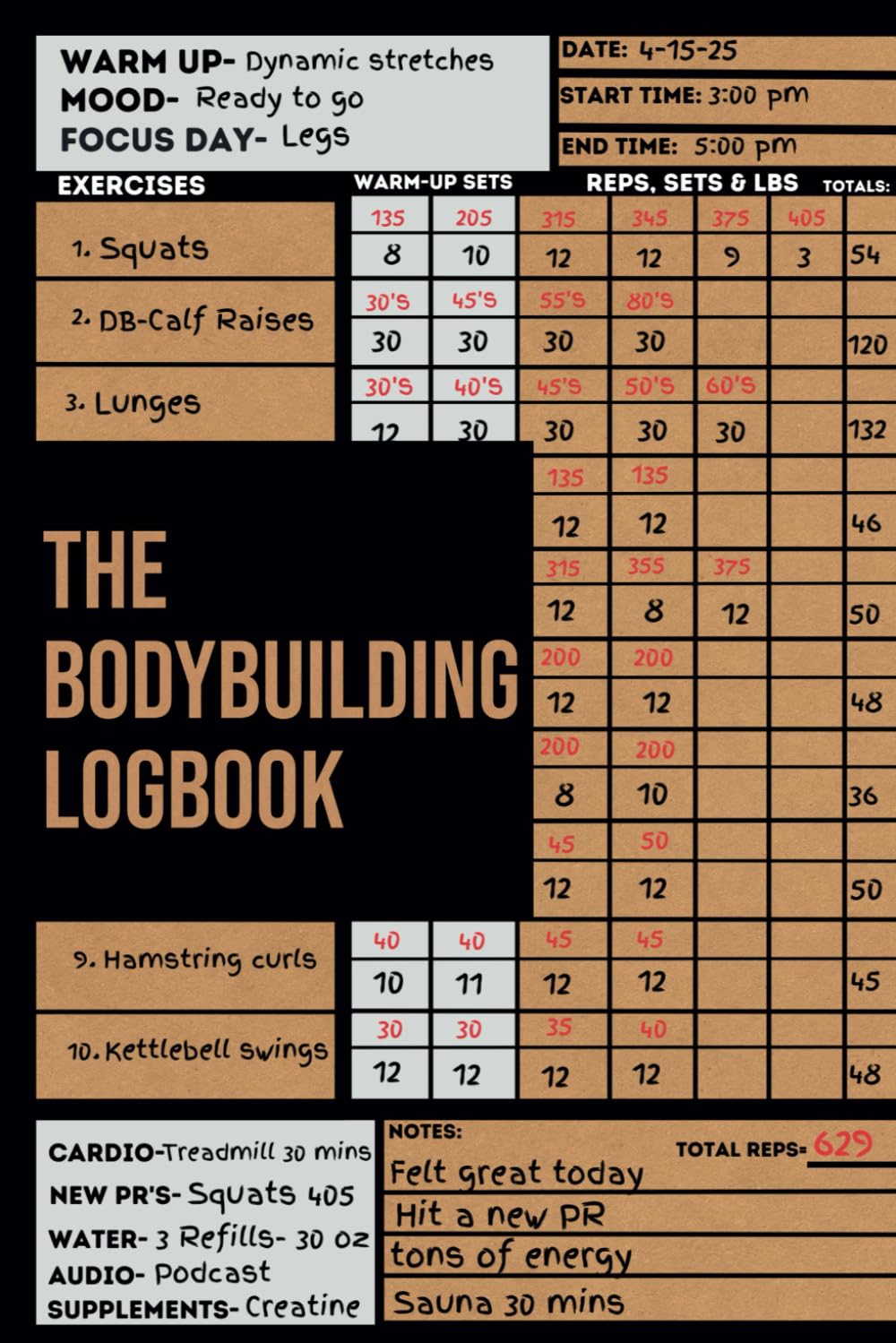
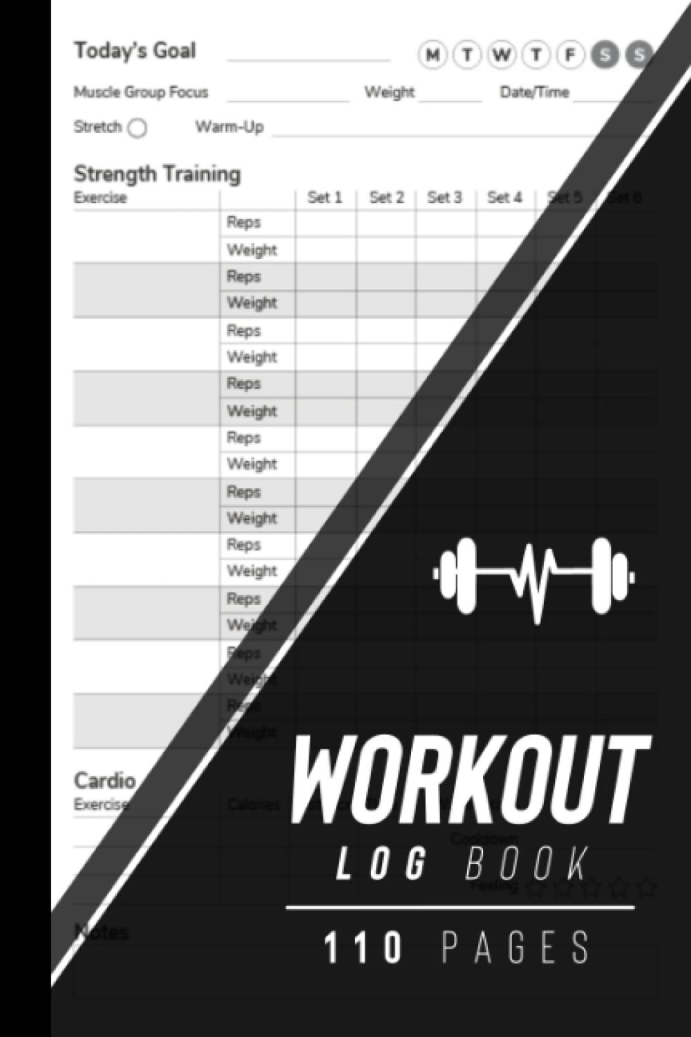
The Big Three tables: bench, squat, deadlift
These are your anchor tenants. They should feel like one family: same spacing logic, same line weights, same numeric rhythm.
Bench
Set · Weight · Reps · RPE · Notes
Bench days generate side-notes—grip width, pause length, shoulder feel. Give notes room. A cramped notes column is where honesty goes to die.
Squat
Set · Weight · Reps · RPE · Tempo · Depth/Feel
Tempo can be a short field (“3-1-1”) and Depth/Feel can be brief (“deep/stable,” “cut high,” “hips pinch”). The goal is fast truth, not prose.
Deadlift
Set · Weight · Reps · RPE · Variant · Grip · Notes
Variant: conv/sumo/deficit/block (keep it quick). Grip: DOH/mix/hook/straps. Notes catch the reality: “slow off floor,” “lockout grind,” “belt last two.”
Design tip: make row height taller than you think you need. Lifters don’t write neatly after hard sets.
RPE scales that don’t shout
RPE is precise when it’s quiet. Avoid decorative gauges and dramatic visuals. Instead:
- A slim tick strip 6–10 (optionally with 0.5 steps)
- Small tabular numerals
- A tiny reminder: “Record RPE at bar down.”
If you want to support RIR users, a discreet note like “RIR ≈ 10 − RPE” is enough. No lecture. No infographic.
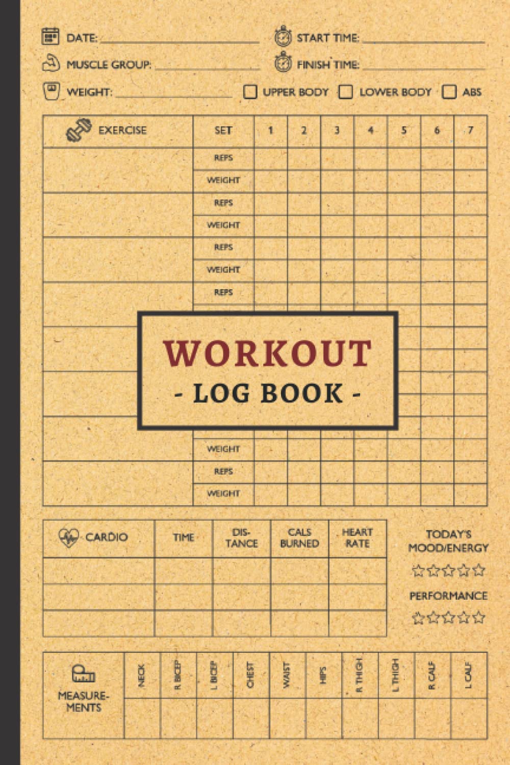
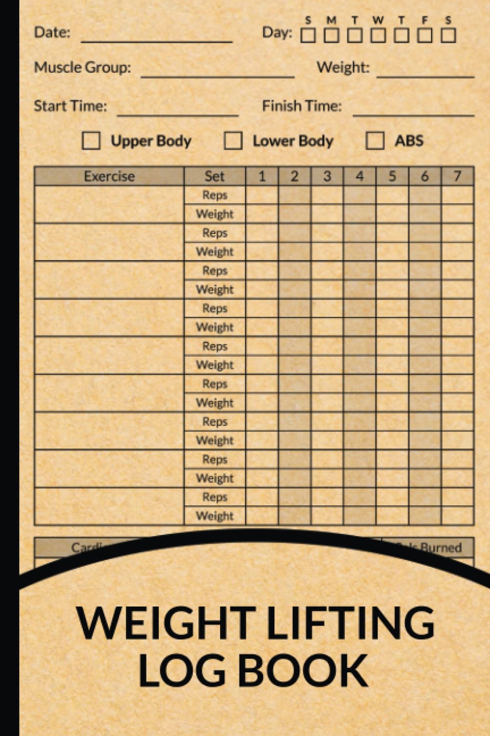
Weekly rhythm: layouts that work when you’re tired
A good week spread should feel like a training cycle laid on concrete: predictable, load-bearing, honest.
A strong structure:
- Top: Session title + date + quick readiness notes (sleep/bodyweight/how it felt)
- Middle: Main lift table (Big Three or “today’s anchor lift”)
- Lower: Accessory matrix (Exercise · Sets · Reps · Load/Notes)
- Bottom: Session Summary (Best set · One fix · Next time)
This is the difference between “I logged it” and “I can coach future me.”
Mobility, rehab, and recovery—without fluff
Brutalism isn’t anti-care. It just hates clutter.
Good supportive blocks:
- Mobility: Hip / Thoracic / Ankle with simple check marks
- Pain/constraint note: a small triangle flag (“knee/back/shoulder”) + one-word reminder
- Recovery cues: Sleep / Steps / Protein / Hydration as circles to fill
- Warm-up ladder: a structured place to build to top sets without doing math on a foggy brain
The tone is supportive, never scolding. Columns don’t judge; they record.
The PR page should look like a plaque
PRs deserve ceremony—without confetti. Think hall-of-record, not party:
Lift · Weight · Date
Optional tiny variant tags (e.g., SQ/HB).
A thin rule under each entry, like a ledger.
If you include a helper, keep it restrained: a small notes area for “sticking point” or “what changed,” so a PR becomes a learning artifact, not just a number.
The index: your training archive (not an afterthought)
Most logbooks toss an index at the back like a shrug. Strength deserves better.
A brutalist index can be:
- Topic | Page(s)
- Symbols for quick scanning (▲ PR page, ● deload, ■ rehab block)
- Space to list cycles (“Hypertrophy Block 1,” “Meet Prep,” “Cut,” “Bulk”)
You’re not just writing workouts. You’re building operating history.
KDP-specific layout discipline (perfect-bound reality)
Because this is a bound KDP book, design for comfortable margins and real handling:
- Give the inner margin more space than you think—binding eats readability.
- Avoid “must-use two-page spreads” for core tracking; each page should make sense on its own.
- Keep tables and headers away from edges so they don’t feel cramped when the book is held open on a bench.
A brutalist logbook should feel stable in the hand—like it was meant to be opened flat-ish, written in quickly, and closed again without fuss.
Common missteps (and fixes)
- Over-engineering: ten columns, micro-text, too many sections → delete until the page breathes.
- “Motivation” graphics: flames, skulls, diagonal slogans → let totals and PRs be the drama.
- Numerals that don’t align: pretty but annoying → switch to tabular/lining.
- Hairline rules: vanish in real conditions → bump line weights confidently.
- Visual noise: if the page needs decoration to feel “finished,” it’s not finished yet—rebuild the structure.
Closing: the set before the set
There’s a moment before a heavy lift where you find the knurl under your fingers and the world narrows to a line you can trust. A great gym logbook gives you that feeling on paper: bold contrast, honest grids, mono numerals, and tables that don’t waste your attention.
Make the page a platform. Let the lines do the lifting. Then load the bar—and write it down.