Homework planners, assignment trackers, and “sticker-style” dividers that make school feel a little sweeter
Open a pencil case in a study café and you’ll see it right away: pastel highlighters, jelly pens, a tiny mascot peeking from the zipper. Kawaii isn’t just “cute.” It’s gentle optimism with a steady work ethic—a visual language that makes ordinary tasks feel cared for. When you translate that into study tools, you get Kawaii Study Companions: planners and trackers that cheer students on without shouting, and layouts that turn progress into micro-celebrations.
This is a design guide for KDP creators building homework planners, assignment trackers, and study journals in a kawaii style. Less “how to be productive,” more “how to design pages that actually get used.” We’ll cover a kawaii aesthetic that photographs beautifully on the cover, while keeping interiors clean, legible, and grayscale-safe—so the book works as a daily tool, not just a pretty object.
What “kawaii” really means in a planner
Kawaii is kindness rendered in shapes: rounded corners, simple faces, soft cues that say “you can do this.” In a study planner, that kindness is practical. It lowers friction at the exact moment students get stuck: starting.
A student isn’t avoiding the assignment because they hate writing lines on paper. They’re avoiding the feeling of too much. Kawaii design helps by making the first step smaller and friendlier. A page that looks welcoming gets opened more often. A page that feels easy to navigate gets used longer.
KDP reality check: make the interior grayscale-first
For KDP interiors, assume many buyers will prefer (or end up with) black-and-white. So the rule is simple:
Your kawaii interior must work without color.
That doesn’t mean it has to look boring. It means your “cute” comes from:
- shape (rounded labels, badge silhouettes)
- line weight (clear headers, soft rules)
- spacing (breathing room around writing areas)
- consistent icon system (small stamps, not big cartoons)
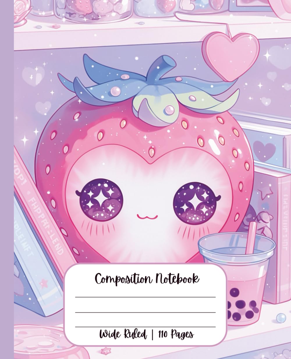
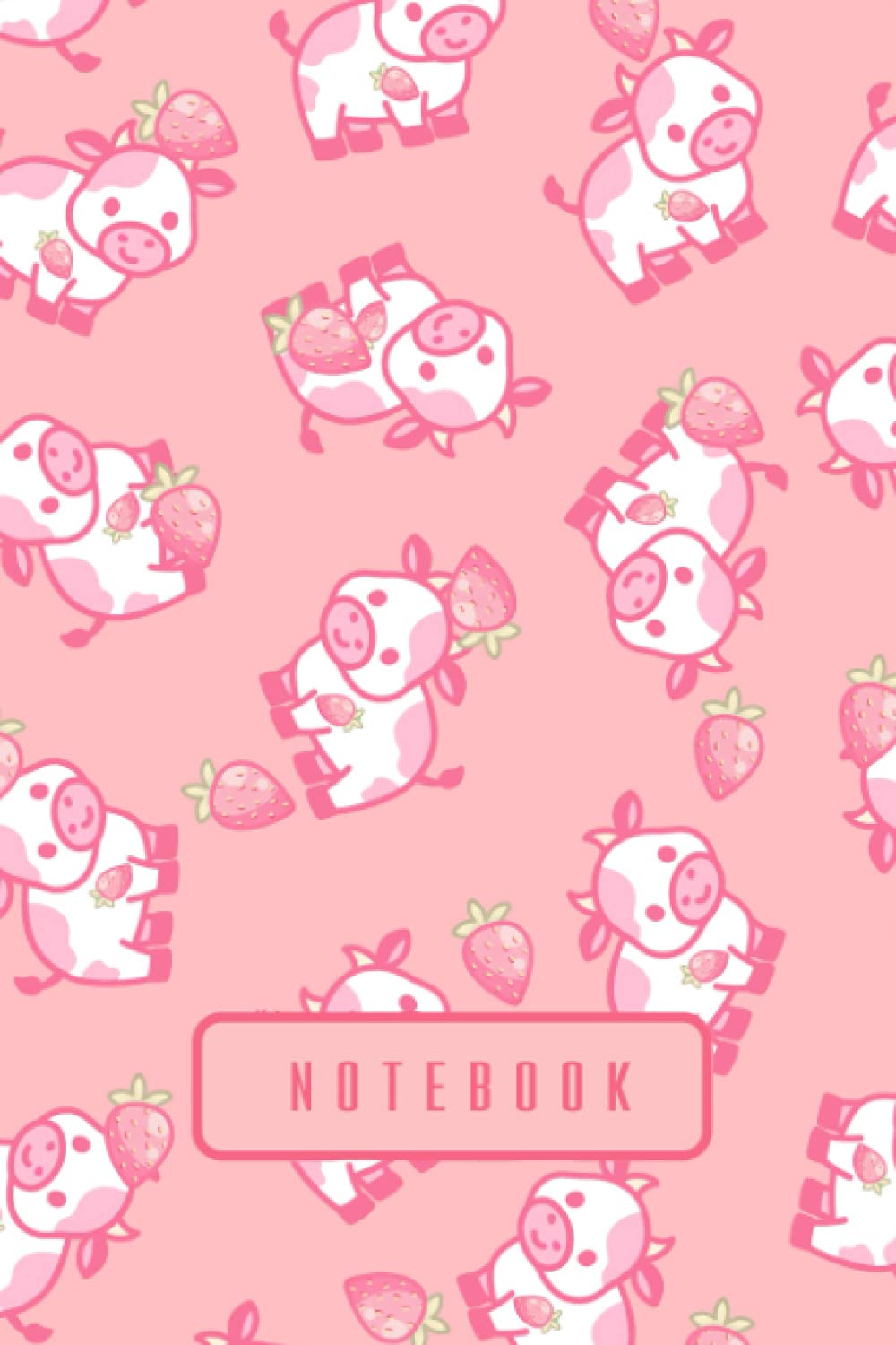
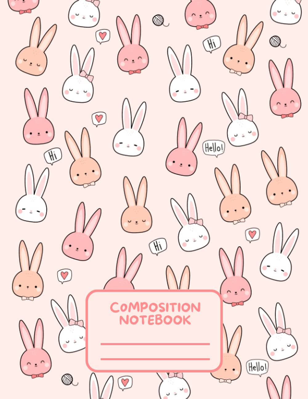
If you want color, save that energy for the cover, where kawaii palettes can shine and thumbnails can pop.
The design system: cute, calm, consistent
1) Palette (cover): pastel without the sugar crash
Kawaii palettes are light, but not washed-out. Think milk-tea neutrals paired with sherbet accents: peach, lavender, mint, sky, butter, sakura pink. Keep it disciplined:
- Two primary pastels
- One supporting pastel
- One warm neutral
- One outline/anchor tone (charcoal instead of harsh black)
This gives you a cover that reads sweet and modern, not chaotic.
2) Typography (interior): rounded cheer + clear function
Kawaii typography works best with three voices:
- Rounded display for the biggest headings (WEEKLY PLAN, ASSIGNMENTS)
- Clean, readable text for lists/dates/notes
- Minimal accent style for tiny labels (Due, Break, Focus)
Key restraint: don’t turn the entire interior into “cute fonts.” If the student can’t scan the page in 3 seconds, they won’t use it under pressure.
3) Icon language: small chibis that do a job
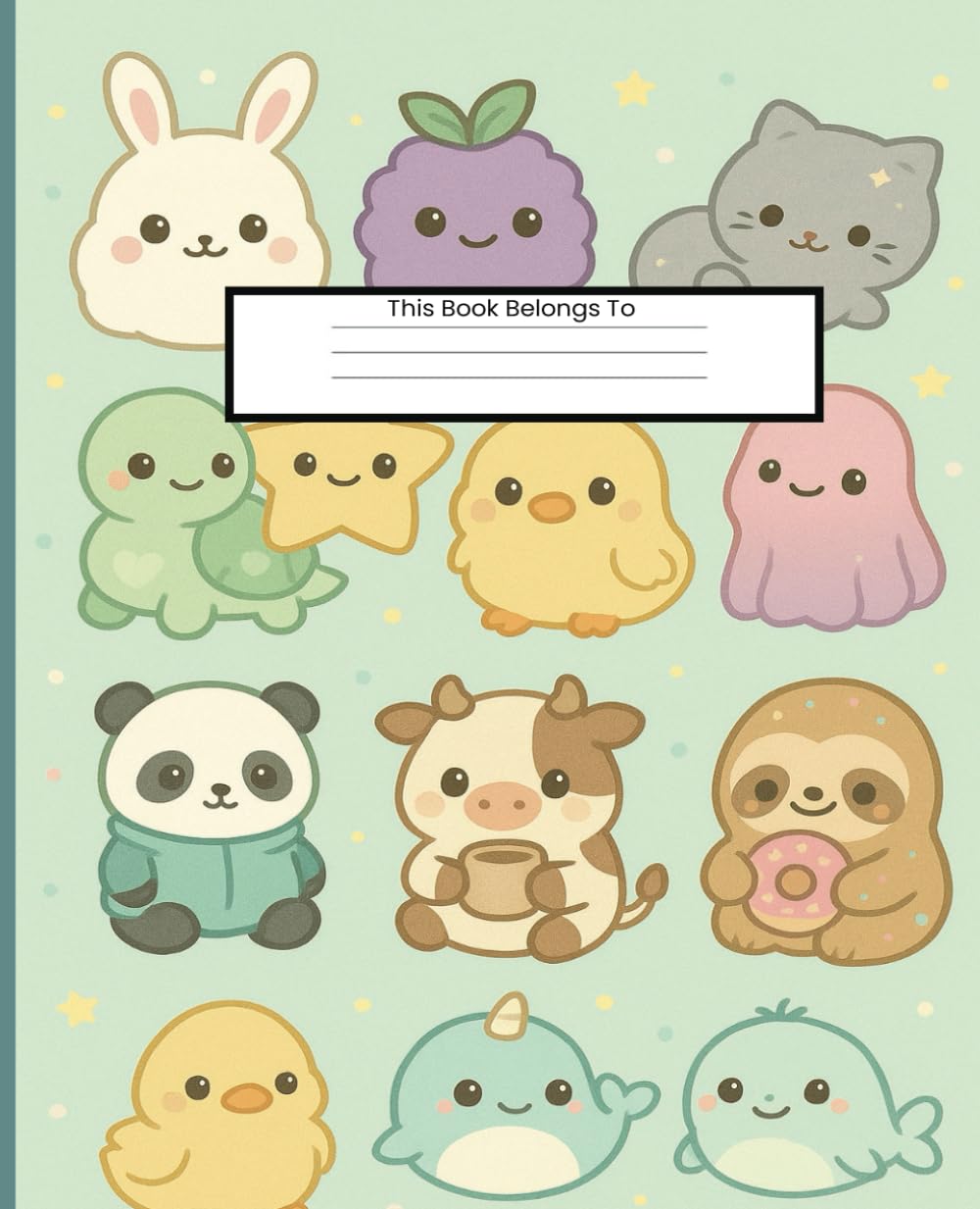
A chibi character is a simple form: circle head, bean body, dot eyes, tiny mouth. In study tools, chibis should behave like stamps—tiny companions in the margins that provide cues.
Great options:
- Mood beans (focused / sleepy / proud / stressed / calm)
- Subject buddies (book-with-glasses, bow-topped pencil, shy calculator)
- Micro-reward marks (star, ribbon, laurel)
Keep icons small and consistent. If they get too big, they stop being kawaii support and become visual noise.

“Sticker-style” layout… without needing stickers
The magic of kawaii stationery is that “peel and stick” feeling. In a KDP book, you can simulate that look with printed shapes that read as sticker-like:
- Rounded label badges (“Homework,” “Reading,” “Quiz”)
- Washi-tape style divider strips (torn-edge silhouettes, polka-dot patterns)
- Margin “label-me” shapes (blank badges students can circle, shade, or mark)
Even in grayscale, these elements feel tactile because their silhouettes do the work.
The page mood: playful, not noisy
Kawaii is happiest when it breathes. Design for calm:
- generous margins
- shorter lists by default (5–7 items)
- light rules for writing, heavier lines for section anchors
- visual breaks between blocks (a divider strip, extra white space)
A quick test: if the page looks busy before handwriting is added, it will feel stressful once students fill it.
Core pages that sell (and get used)
1) Weekly Homework Planner
Think of it as seven gentle panels: each day is a small “scene” with a mascot cameo.
Header block
- “Week of ____” with a small icon
- one small motivational line (optional): “Start small. Keep going.”
Daily blocks
Each day gets two lanes:
- DUE (3 lines)
- TO-DO (5 lines)
Why two lanes? Because “due” and “do” are twins—and separating them reduces overwhelm.
Footer: Small Wins
Five tiny checkboxes for habits that support studying:
- packed bag
- started early
- reviewed notes
- stretch break
- water
These are micro-successes that make the planner emotionally rewarding.
2) Assignment Tracker (Project Card)
Big assignments fail when they remain one big blob. Kawaii design shines at chunking.
Project Card template
- Course badge + assignment title
- Due-date “ticket” shape (simple rectangle with clipped corners)
- 5–8 micro-task checkboxes:
- outline
- sources
- draft
- revise
- proof
- submit
- “Time Blocks” row: 3–5 circles to fill as sessions are completed
- tiny celebration icon next to “submit”
This turns dread into steps.
3) Reading Log that feels achievable
A reading log should not look like punishment.
Use a simple grid:
- Page Range
- Time Spent
- One-line takeaway
Optional “micro-reward”:
- a small star box that’s checked when a student completes 30 minutes
Even a symbolic reward increases follow-through.
4) Daily Focus Page
Some students don’t need a weekly planner—they need a today page.
A great kawaii daily page includes:
- One Big Thing (1–2 lines)
- One Little Thing (1–2 lines)
- To-Do (5–7 lines)
- Focus Dots (4–6 circles) for study sessions
- Mood bean (pick one)
This is structure with mercy.
5) Gentle “study rhythm” trackers
You don’t need to say “Pomodoro” to get the benefit.
Examples:
- “Focus Bursts” row: 6 circles
- “Break Check” row: 3 tiny icons (stretch, snack, water)
- “Back to it” prompt: “What’s the next 5-minute step?”
Design = choreography. You’re guiding the student back into motion.
Accessibility is part of kawaii’s promise
Cute shouldn’t be hard to use:
- keep body text truly legible
- avoid overly thin lines
- keep icons readable at small sizes
- don’t rely on color for meaning
- leave space for messy handwriting
Kawaii is kindness; usability is kindness too.
Series strategy: build “scenes” (collectible, consistent)
Create 3–4 visual “scenes” that share the same interior framework:
- Sakura Semester (pink blossoms + soft badge shapes)
- Milk-Tea Mornings (warm neutrals + sleepy cat icons)
- Sky-Blue Focus (cloud buddies + calm daily pages)
- Mint Study Club (club badges + group project trackers)
Covers can vary scene-to-scene; interiors stay consistent and tool-first.
Common missteps (and quick fixes)
- Too many icons: pick 6–10 and reuse them consistently
- Crowded lists: cap at 5–7 items and add a second list page instead
- Over-script fonts: use script only for tiny accents
- Color-dependent meaning: switch to shapes, labels, and line weight
- Over-designed pages: reduce decoration until the writing areas feel generous
Why Kawaii Study Companions work (and keep working)
They lead with emotion, then deliver structure:
- Emotion first → easier to start
- Micro-rewards → momentum builds
- Clear hierarchy → pages stay usable under stress
- Grayscale-safe interior → tool remains dependable
If the book gets opened because it’s adorable—and used because it’s clear—you nailed it.