Dated/undated spreads, mood trackers, and the soft neon hum of a future we once imagined
Open a drawer from the year 2000 in your memory and the light changes. It’s the blue of a CRT screen at midnight, the gloss of a phone that wasn’t yet smart but wanted to look like it might be. Lime-sherbet plastics. Translucent consoles. Text that feels poured from liquid chrome. The Y2K aesthetic—equal parts club flyer, operating system skin, and toy aisle—didn’t just predict the future; it staged one. Now it’s back with a grin, and on paper it becomes something surprisingly perfect: diaries and planners that glow without electricity.
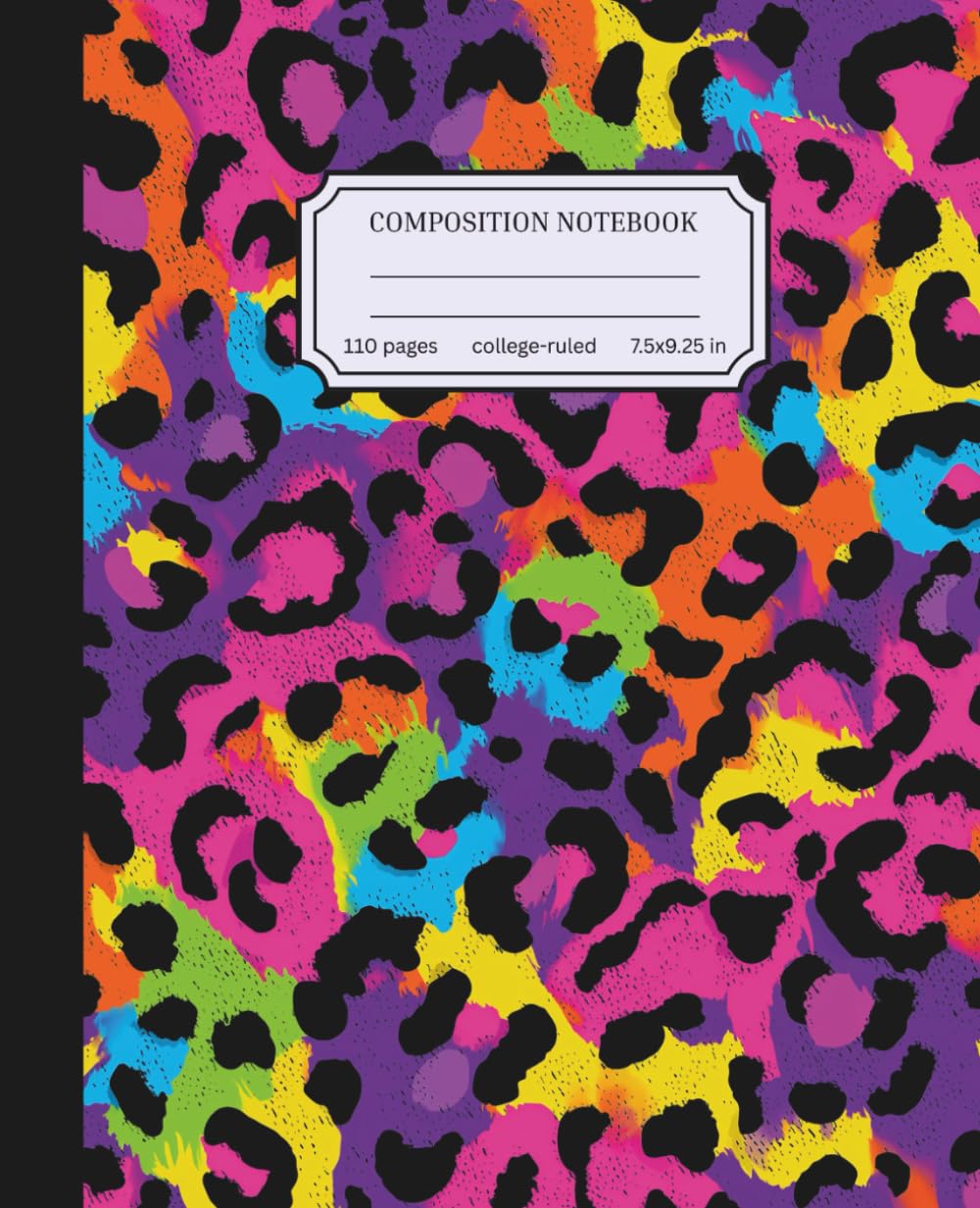
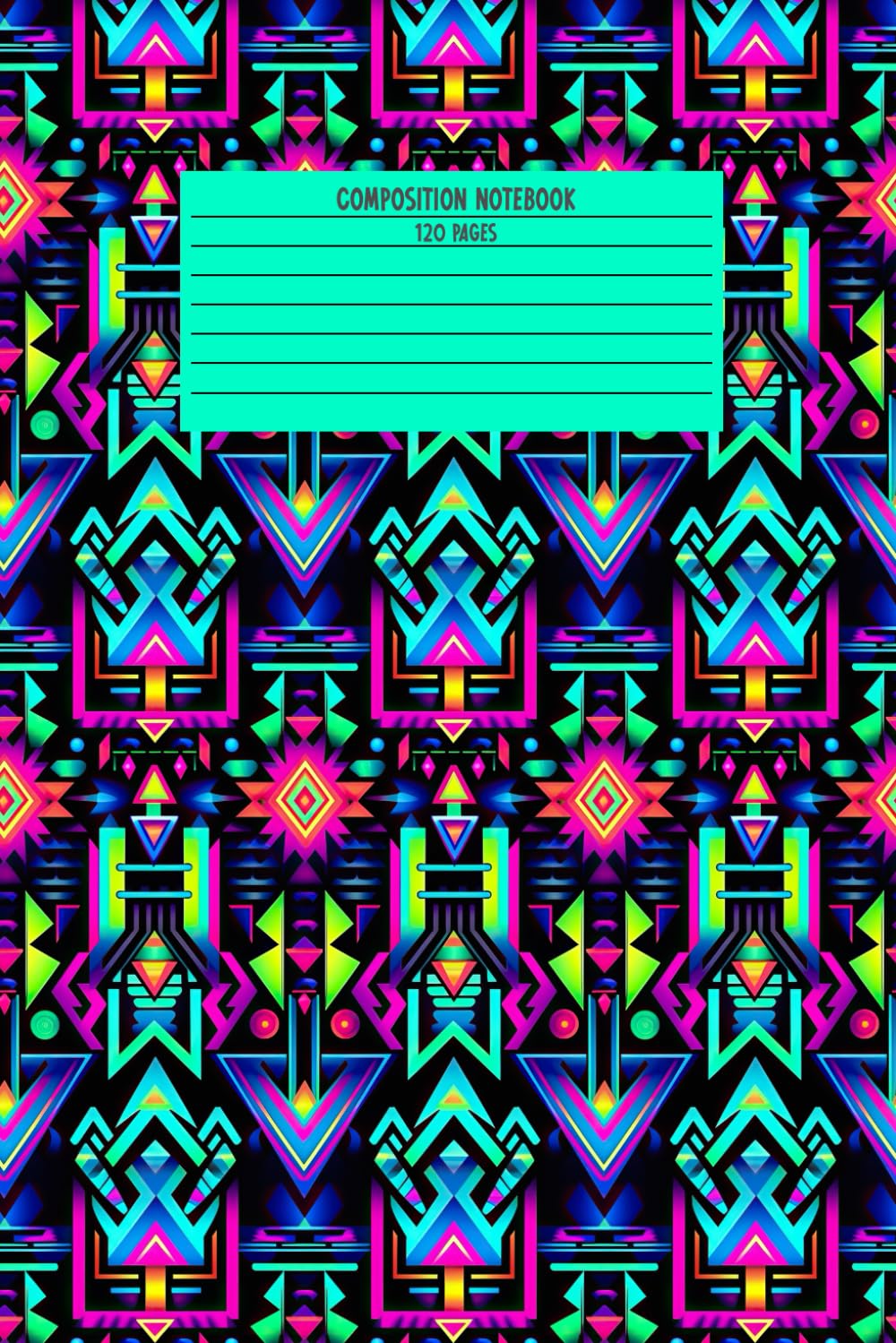
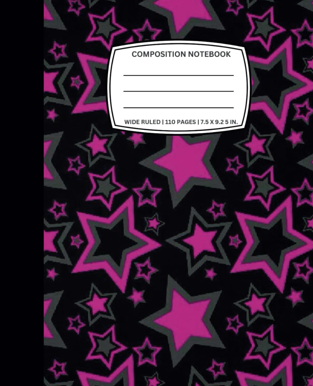
This is an ode to Neon Y2K Diaries: covers that read like jelly, chrome illusions and pixel icons used like jewelry, and interiors built for dated or undated planning with small, semi-digital rituals like mood trackers. Less “how-to,” more “why-now”—where the look came from, what it means, and why it still feels like possibility when you hold it in your hands.
The promise of almost-tomorrow
Y2K was made of anticipation. Dial-up became broadband. The web stopped being a place you “visited” and started to feel like a neighborhood. Designers dressed for that neighborhood like it was a club at the edge of space: Bondi-blue iMacs, translucent devices, shiny UI buttons, slick gradients, mirrored type in music and car ads. Everything wanted to look clickable.
On paper, that energy became laminated tabs, sticker sheets, and gel-pen trails. The diary was your portable future—half school tool, half “interface” you could customize. The optimism is what still hits: technology as fun, style as playful, and life as something you could log like a track list.
Chrome you can touch
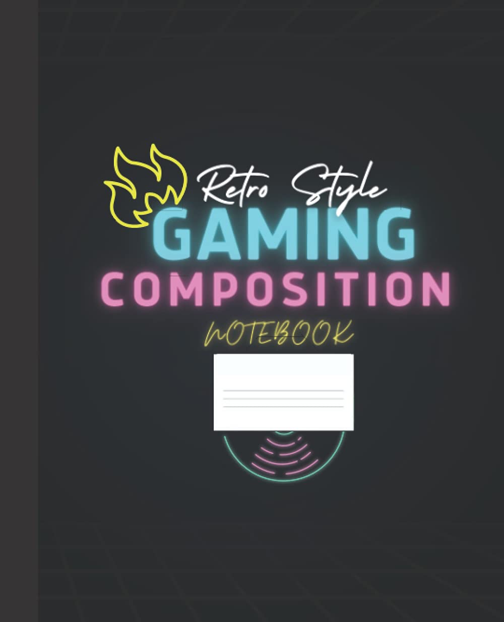
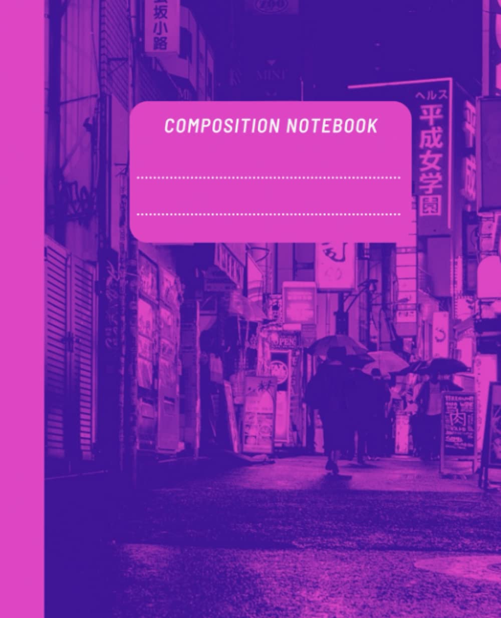
Chrome in Y2K design wasn’t real metal; it was illusion—airbrushed highlights, soft shadows, specular streaks. On a diary cover, chrome is the headline: a title that catches light even in a dull room. The trick is confidence without yelling. It doesn’t scream; it winks.
Inside the book, keep the chrome impulse conceptual: rounded badges, “button-like” headers, small icon frames—details that feel UI-inspired without relying on ink-heavy effects. Paper chrome is really about a contradiction your brain loves: your fingers know it’s ink, your eyes swear it’s brighter than it should be.
Jelly everything
If chrome was Y2K’s stage light, jelly plastic was its furniture—clear pagers, candy phones, see-through shells that made tech feel friendly because you could “see the magic.” On diary covers, that becomes the poured-jelly look: candy translucence, inner glow, rounded geometry, soft edges that feel like early device UI.
The key to the revival is permission. After years of matte minimalism, jelly is surface joy again—bubbly, sweet, unashamed.
Pixels as punctuation
Before icons went photoreal, they were pixel art: tiny, crisp, efficient. That language is perfect for diaries because it reads instantly and carries a nostalgic honesty. In interiors, pixels work as punctuation: little hearts and stars, tiny “status” symbols, mood trackers built from small grids, energy bars you fill like signal strength. The charm is constraint—“good enough to read”—which makes the whole book feel humane. It says: this is for logging, not judging.
Covers that shout in thumbnails (and why that matters)
Print-on-demand lives in a grid of tiny images, and Y2K was trained by low-resolution screens. That’s why the aesthetic performs so well now: bold silhouettes, chrome-style wordmarks, clear iconography, and jelly gradients that read from one inch tall.
Keep the neon conversation on the cover: energetic sorbet palettes, high-contrast pop, and gradients that slide like a UI transition. Inside, let structure do the work—big labels, clean modules, plenty of breathing room—so it prints reliably and stays easy to use.
Dated, undated, and starting anywhere
Y2K diaries never waited for January 1st. You bought one when the cover made your heart jump. That spirit makes undated spreads feel especially right: title chips you fill in, simple month markers, pixel stars to flag a fresh start.
Dated layouts can lean into the “operating system calendar” vibe too—repeatable, ceremonial, dependable. Either way, the thesis is the same: you can start now. Neon Y2K is anti-gatekeeping; it’s for jumping in mid-song.
Mood tracking in vapor and glass
If Neon Y2K diaries have a beating heart, it’s the mood tracker. The era turned feelings into interface cues long before wellness apps: smileys, status lights, ambient glows. On paper, that becomes satisfying rituals—bars you fill, tiny grids you complete, month-at-a-glance “pixel pictures” of how you felt.
For people who love the look, the style isn’t decoration—it’s permission structure. A diary that feels like a friendly device makes daily input easier because even a rough day looks like something you can “clear” and try again tomorrow.
Structures that feel like software (without pretending to be a screen)
The best versions borrow UI logic, not UI clutter. Think: dashboard panels, modular sections, pill-shaped tabs, clean “menu” organization (Goals, Notes, Music of the Week, People). The benefit is emotional: it turns overwhelm into a set of choices. You’re not facing a wall of lines—you’re pressing a button.
The club, the mall, the bedroom
Y2K lived in three stages—and a diary thrives when it blends them:
- The Club: chrome over dark space, drama, laser energy
- The Mall: friendly retail gloss, sticker-tab fun, affordable “new tech” vibe
- The Bedroom: private lab of pens, collages, lists, and self-assembly
That mix is why the look can be loud on the cover but tender inside: the outside performs, the inside holds your real life.
Closing the clamshell
The best Neon Y2K diaries overdeliver on feeling: chrome that smiles, jelly gradients that glow, pixels that keep pace with your hand. Dated or undated, the structure fades and the vibe remains—a portable almost-tomorrow where you set your own status and log your own quest.
Close the diary. Hear the soft click of a plastic clamshell in your imagination. Tomorrow you’ll open it again and it’ll hum like a miniature neon sign: ON AIR—and you are.