Attendance, rubrics, parent contact logs—designed with dignity, not noise
There’s a moment at the start of a school day when the room is all potential: chairs tucked, date on the board, the hush before the hallway spills in. A teacher’s gradebook sits in that quiet like a heartbeat. It’s not just a ledger of points—it’s attendance patterns in pencil, small wins circled in ink, phone calls logged with “spoke to grandma,” and the exact place your hand paused the day long division finally clicked. In an age of portals and apps, paper still carries authority: it rides on a clipboard, survives Wi-Fi, and welcomes the kind of annotation teachers actually use.
Designing a print gradebook isn’t nostalgia. It’s calm UI on paper: big type you can read while walking the aisles, color that survives school copiers, and layouts that respect the rhythms of attendance, assessment, and communication. The best ones don’t look busy. They look inevitable—like they were always going to work this way.
From ledgers to classroom UX
Teacher registers started as accounting-style ledgers: a quiet grid, roster on the left, days marching across the right. That DNA still works because it matches how a teacher scans: down names, across time. Later came dot-matrix printouts and early software that mimicked spreadsheets—faster, but visually blunt. Today’s classroom is hybrid: districts need systems that calculate, tag standards, and publish to families, but those tools aren’t always kind to human eyes at 7:45 a.m., or built for the choreography of a live room.
That’s where a paper companion still earns its keep: a tactile interface for a job that’s both administrative and deeply relational.
Why the page still matters
Digital systems are invaluable: automatic averaging, late policies that apply themselves, portals that keep families informed. But screens can turn teachers into clerks. And many “print views” are afterthoughts: 8-point fonts, colors that wash out, hairline rules that vanish on copy three.
Paper—designed as paper—has no identity crisis. Your personal cues (stars, circles, half-shaded boxes, “call home”) live right beside the data where your eye will land tomorrow. Most teachers use both, so the modern gradebook should bridge: calm for daily use, tidy alongside whatever software holds the official numbers.
What good gradebooks do (without shouting)
A great gradebook is easy to read at arm’s length, shows patterns without squinting, and forgives messy handwriting and chaotic Tuesdays. That means:
- Big type where it matters: names, weeks, major assessments
- Hierarchy you can feel: heavier section lines, lighter writing rules, generous margins for hole punches and binder rings
- Color systems that behave: limited, copier-friendly palettes that still make sense in grayscale
- Layouts that respect real work: attendance boxes you can hit while greeting students, rubrics that don’t read like tax forms, contact logs with room for human context
Most failures come from confusing density with clarity: timid line weights, tiny labels, screen-chosen colors that evaporate on a copier.
Calm UI, on paper
UI isn’t just for screens—it’s whatever reduces friction during a class period. Calm UI starts with restraint: no decorative clutter, no icons that require decoding, two fonts (or one strong family), and white space trusted as a tool. It also respects motion: teachers glance while standing, scan while calling names, and tilt clipboards mid-question. Big type catches the eye exactly when needed. Section dividers act like landmarks. With use, your fingers find pages by touch.
Calm doesn’t mean bland. It can be beautiful in the way a well-made tool is beautiful.
The three pillars: attendance, assessment, communication
Most gradebooks revolve around three views of time:
Attendance (daily rhythm). A slightly larger roster column, then clean day columns to the right. Symbols should be obvious and copier-proof: dot (present), open circle (excused), slash (late), square (verified absence). If you add color, keep it as a light accent—never the only cue.
Assessment (unit heartbeat). Rubrics and entry grids should show progress across assignments, not just numbers in boxes. Make descriptor type readable enough to evaluate with, and give score cells room for natural handwriting.
Communication (semester story). Contact logs should be plain and respectful: “Date, Method, Topic, Next Step,” plus faint but reliable follow-up cues. This section should flip open fast when an administrator asks for context—it signals professionalism.
When all three share the same visual grammar (line weights, type choices, restrained accents), the book feels like one instrument instead of mismatched forms.
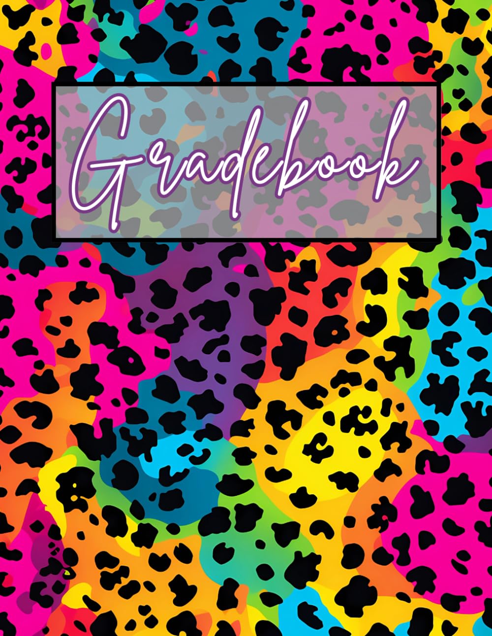
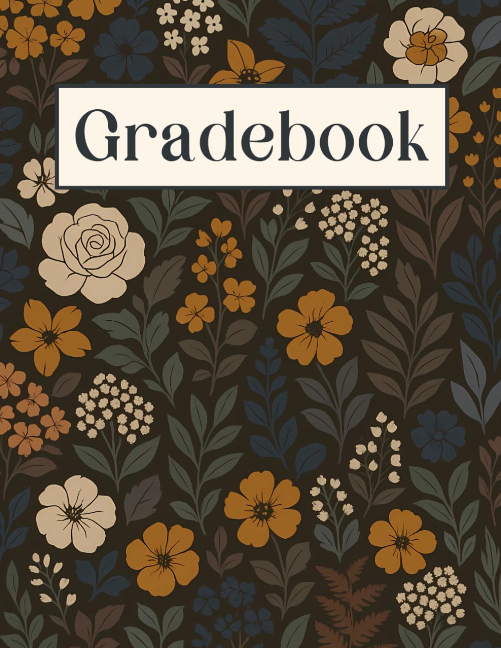
Color systems that print (and survive the copier)
Copiers punish delicate tints. Treat color like ink, not light: one dark anchor (charcoal/deep navy/forest) plus one or two mid-tones (sage/clay/muted blue) for section or week banding. Avoid pale pastels for structural elements. If color marks meaning, pair it with something that survives grayscale—labels, patterns, textures, or clear headers.
Design in black and white until it reads beautifully. Then add color like lemon in tea.
Big type isn’t loud; it’s kind
In a classroom, big type is accommodation. Dates shouldn’t whisper. Week numbers shouldn’t require tracing. Names should be legible enough that a sub can take attendance without guessing. “Big” doesn’t mean heavy—larger type can float if your rules stay fine. Done right, the page disappears into muscle memory: scan, mark, move on.
The quiet elegance of the best ones
Open a well-designed gradebook and you feel the difference immediately: weeks gently banded, rows easy to track, marks handsome even when rushed. Rubrics read clearly, scoring doesn’t require tiny numerals, and contact notes have room to sound like a person—not a form.
That’s the bar for teacher gradebooks in print-on-demand: calm UI that understands the school day, type that respects movement and fatigue, and color systems chosen for what printers actually deliver. Design it like anything that matters—built for people using it under pressure, with love.