Prompts, tracker pages inspired by CBT techniques (without medical claims), and reflection spreads that breathe
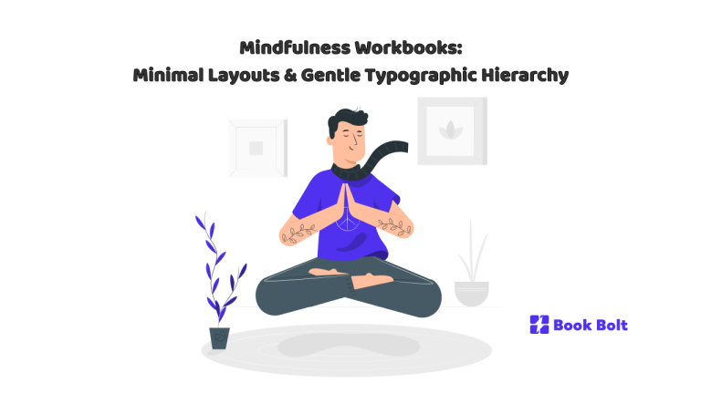
There’s a sound paper makes when you turn a page slowly—dry, soft, almost like fabric. That’s the sound good mindfulness workbooks are built around. Before any prompt, chart, or line to fill, there is space. Space isn’t empty; it’s an active ingredient. If the last decade taught stationery to hustle, mindfulness workbooks ask it to do the opposite: invite, unclench, hold. The designer’s job is less to decorate than to lower the noise floor of a reader’s day. Minimal layouts and gentle typographic hierarchy are how you do it.
This is a tour of that aesthetic—how type, margins, paper tone, and small rituals turn a workbook from “pages” into a companion. It also nods to structured self-observation spreads sometimes inspired by cognitive-behavioral techniques—kept strictly practical here, with no medical claims. Think studio visit, not manual: how to make a book that steadies the hand before it even lifts a pen.
The calm before the words
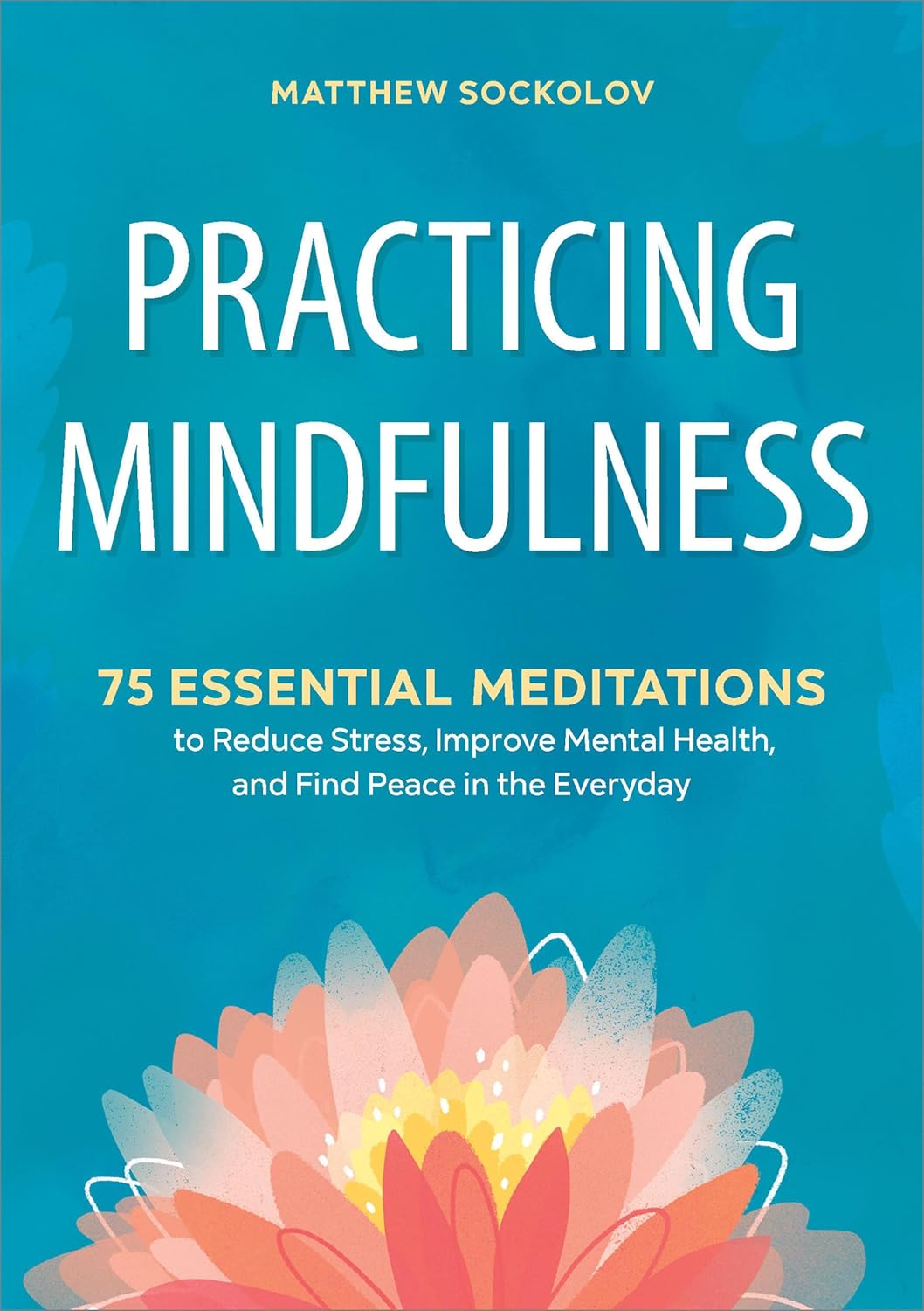
Most people arrive with a busy head. The book’s first promise is deceleration, and it starts on the cover: matte fields (bone, fog, tea, stone), a readable title in a soft serif or quiet grotesk, no glossy shouting. If there’s ornament, it’s minimal—a thin rule, a seed, a moon sliver. Even the spine whispers.
Inside, the first spread should feel like an exhale: generous margins, an optional one-sentence epigraph, and ink that reads as deep charcoal instead of pitch black. Absolute black can feel like a command; charcoal feels like a companion taking a seat beside you. Minimalism here isn’t austerity. It’s hospitality.
Hierarchy that doesn’t hustle
Gentle hierarchy means the eye never argues with the hand about where to start. Use one typeface for headings (an old-style serif with small caps can be beautiful) and a neutral sans for labels and numbers—or keep it all in one strong family. Keep sizes few. Let spacing and weight do the work: a semibold title, a regular subhead with air, and body text you can read while breathing slower. Big type isn’t loud; it’s kind.
Headings should read like room labels: Today, Notes, Three Things I Noticed, A Thought I Can Hold Gently. If you need a third voice, use casing or tracking—not a new font that startles. Good hierarchy disappears. If the pen never pauses to search for “where now?”, the page is doing its job.

Language with the edges sanded
Minimal layouts can be ruined by bossy sentences. Prompts should feel like open doors, not quizzes. Swap “Identify your triggers and reframe your cognition” for “What happened?” and then: “What did you notice in your body, your thoughts, your behavior?” These aren’t medical instructions; they’re invitations to notice. A workbook that respects agency uses verbs like notice, name, describe, choose. It avoids diagnosing, and it measures nothing you couldn’t share over tea.
Tone matters as much as line spacing. “Write three gratitudes” can feel like homework; “Three small things that felt good” feels like permission. That’s the point.
Grids that breathe, lines that forgive
Minimalism loves a grid, but not a prison. Rules should be soft—thin strokes, light tints, dotted lines when possible. Give extra inner margin (binding eats space) and bottom margin (notes tend to spill). Boxes are for groceries; fields are for thoughts. When rows are useful—day logs, habit trackers—make them tall and roomy for real-world writing angles on couches, buses, and kitchen tables.
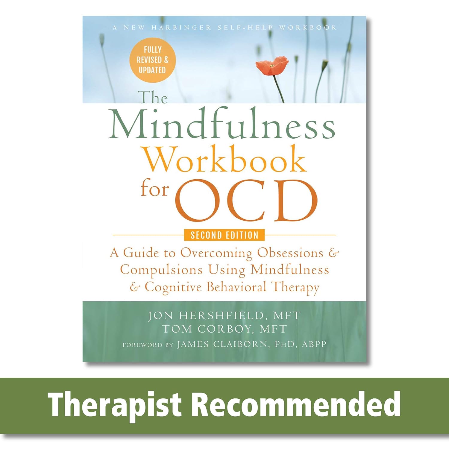
Quiet scaffolds inspired by CBT (no claims)
Some effective mindfulness pages borrow structures from clinical worlds purely as everyday observation tools. Think scaffolding for self-awareness, not therapy.
A spread might be a calm trio: Event → Thought → Action, each with real breathing room. Or add Feeling and Afterwards. You’re not promising outcomes; you’re giving the day a place to sort itself.
Trackers can be simple: a week of small circles (“Did I step outside?” “Did I drink water?” “Did I text someone I like?”), or a light two-axis square (intensity vs. duration) where moments become dots. What keeps these from feeling clinical is restraint: kind labels, soft lines, and enough blank space to write the unexpected.
Reflection spreads that feel like porches
If prompts are doorways, reflection pages are porches. Design them like places to sit. A quiet header—After / Later—a small band for date or “weather,” then a big open field. Not ruled to death, not chopped into boxes. Just enough dotted grid to steady handwriting, plus a tiny corner cue that says, if you want, sketch. Some readers list. Some draw spirals. The page shouldn’t vote. It should widen.
The mercy of starting over
People don’t begin mindfulness on a clean January 1st. Good workbooks honor the right to begin again. Use undated weekly/monthly spreads with delicate date lines, or tiny spaces for stickers or stamps. If it is dated, keep it gentle: no guilt language, no loud “missed day” energy. A skipped page should read as neutral—not failure.
Icons that behave
Icons tempt designers to be cute. Here, they must be quiet: a small sun, cloud, droplet; a leaf, a cup, a footstep. Match line weight to your rules. Keep scale consistent. If an icon becomes a habit cue, it earns its place. If it competes with the words, it’s distraction masquerading as charm. Print the page and walk away: if your eye jumps to the icon first, shrink it until it behaves.
Sequence as story
Order matters. A good flow feels like a day: arrive, settle, notice, act, reflect, rest. Use threshold pages at section starts (one sentence, a simple line drawing) as breaths. Repeat a handful of “arrival” prompts so the reader can memorize the structure. End with a closing page—an open field and a tiny sentence in the corner: You can stop here. Consistency is kindness; predictable structure lowers friction and increases honesty.
Thumbnails, shelves, and clarity
Print-on-demand lives in a grid of tiny cover images. Minimalism can vanish at thumbnail size, so design clear silhouettes: a stable title word-mark and a calm, single-shape cover beat busy collages every time. Inside preview images should show one strong idea per frame: a reflection field, a simple log, a gentle weekly spread. Clarity sells; clutter apologizes.
Accessibility is part of the aesthetic
Minimalism that excludes is just fashion. Consider larger body sizes than you think you need. Use friendly contrast for low light and readers with astigmatism. Keep lines distinct enough for tremor to land a pen. Leave margins where left-handed writers won’t shadow their work. If color is used, don’t let it be the only way meaning is conveyed. Calm design and accessible design want the same things: legibility, predictability, respect.
The quiet promise
Minimal layouts and gentle typographic hierarchy aren’t just a look—they’re a stance. They say the reader’s experience is the main content. They say prompts are doors, not tests; trackers help noticing without measuring worth; reflection pages should feel like porches with a view.
If you’re building a mindfulness workbook for BookBolt’s world of thumbnails and reviews, remember the deeper economy at work: attention. Spend yours to save the reader’s. Choose paper that likes pencil. Set type that reads from a lap. Keep the grid soft. Trust quiet. The payoff isn’t just a beautiful object—it’s a book people actually use, slowly and kindly, for longer than they expected.