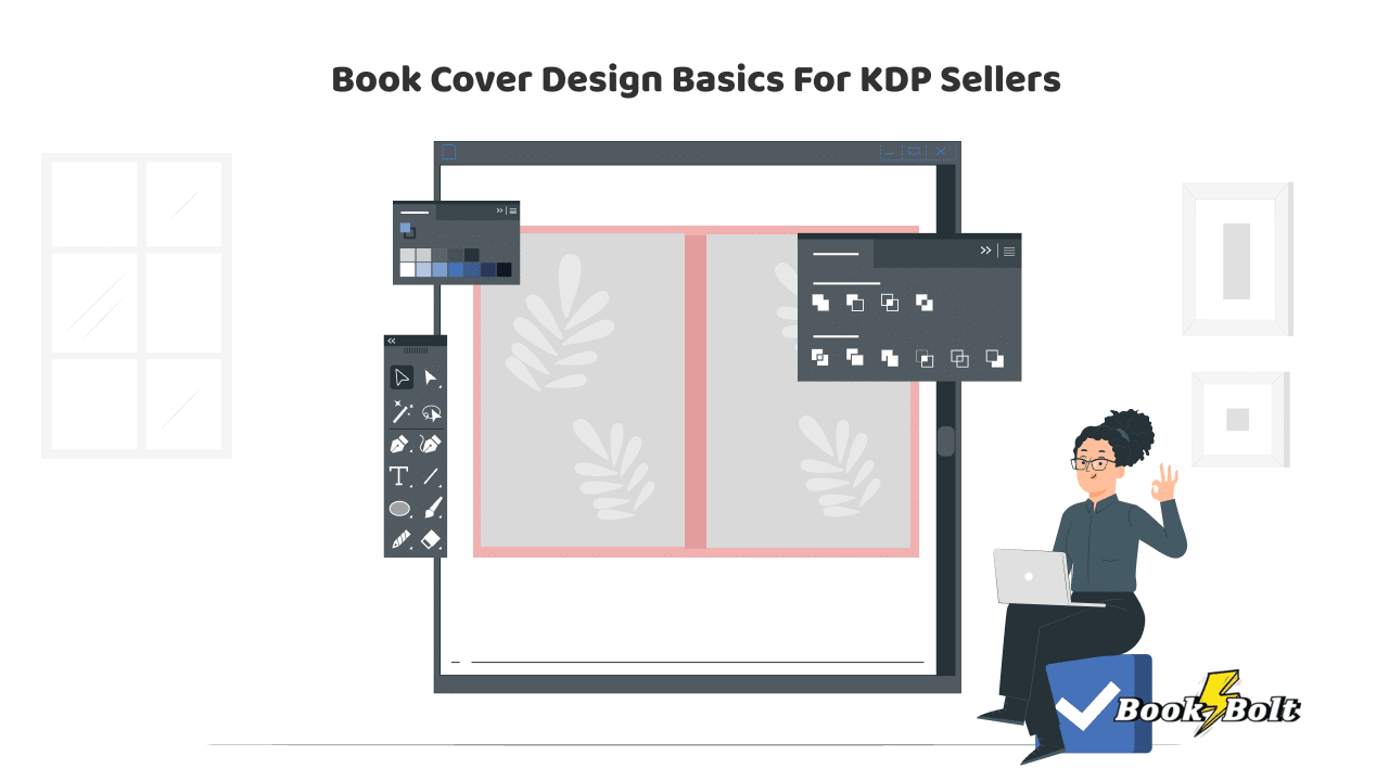
Whether you’re new to KDP or a veteran, it’s always a good idea to review some of the basics. And there’s nothing more basic than the cover of your book.
Your cover, after all, is your billboard. con
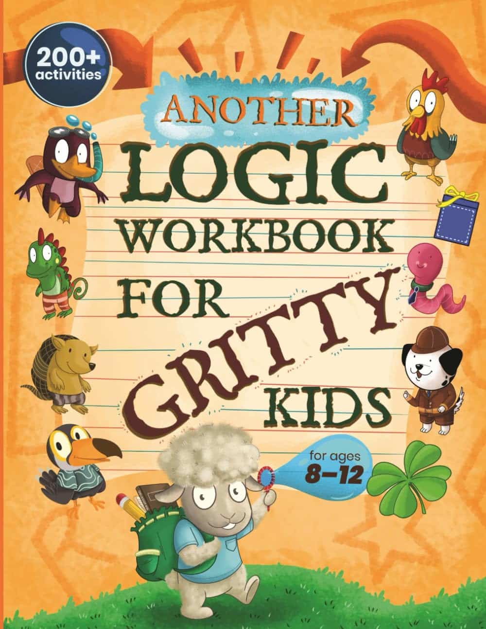
THE FRONT COVER
The front cover is a preview of your book. Just like a movie trailer helps viewers decide whether it’s worth buying a movie ticket or ordering from a streaming service – it’s what the reader is going to use to judge whether or not to invest their money and time into your content.
The objective here is to attract, intrigue and hook.
Book Cover Imagery
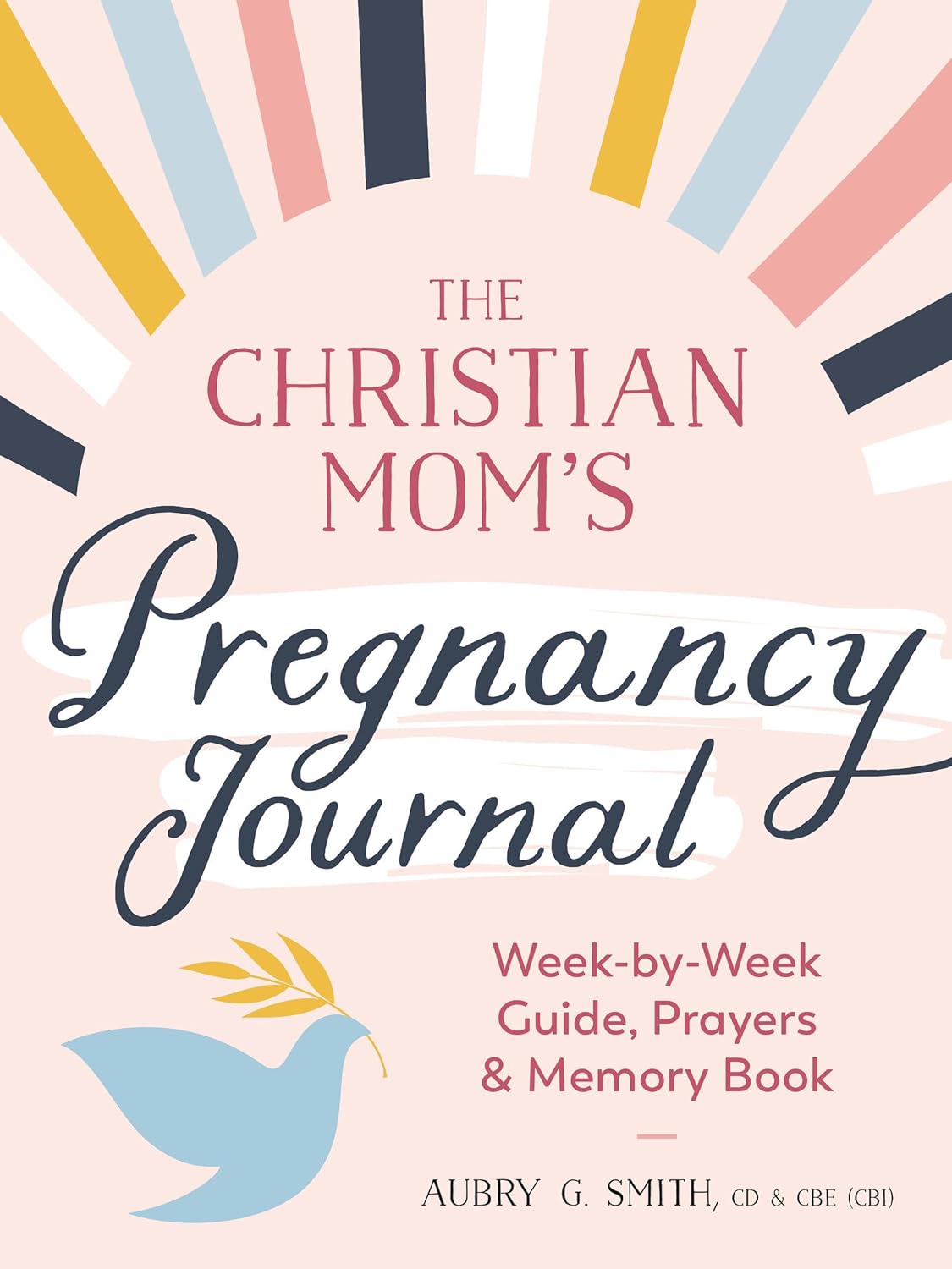
Non-typographical imagery could include a photo, an illustration, or even just interesting plays on shapes and colors. The imagery should remain true to the content, so unless your word-search book is about horses, don’t put a horse on the cover.
Be design-aware: don’t overwhelm your typography with the imagery. The imagery should catch the eye, but then the customer’s eye should automatically go to the typography.
Typography
The cover’s typography should include three things:
- The title
- The subtitle (some consider this not critical; I strongly disagree)
- The author’s name
There’s a bit of a hierarchy to the size of the text. The title should be largest, the subtitle next, then the author name. When you become Stephen King or John Grisham of low-content books, you can make the author name bigger, because then the author is as much a marketing tool as the title.
Book Cover Design Tips
Now that you have the geometry of your cover, let’s talk about what the whole of those parts should accomplish.
Provide a sneak peek of the contents
If you’re making a Sudoku book, for example, the imagery should incorporate at least a small or background image of the Sudoku grid. Players seek these out specifically, so you’re certain to catch that audience’s attention even before they even notice anything else.
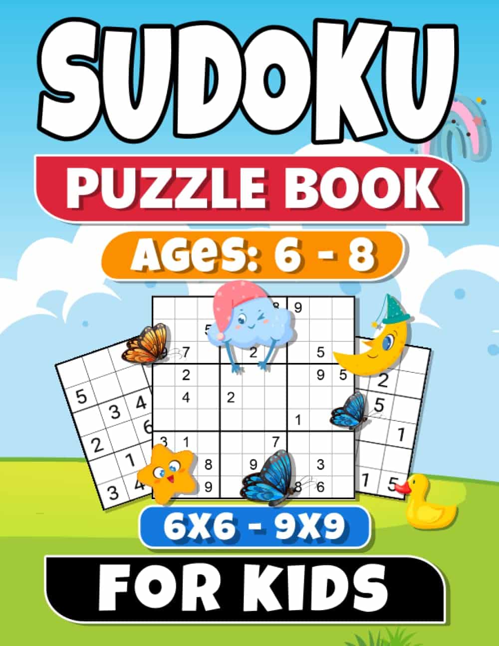
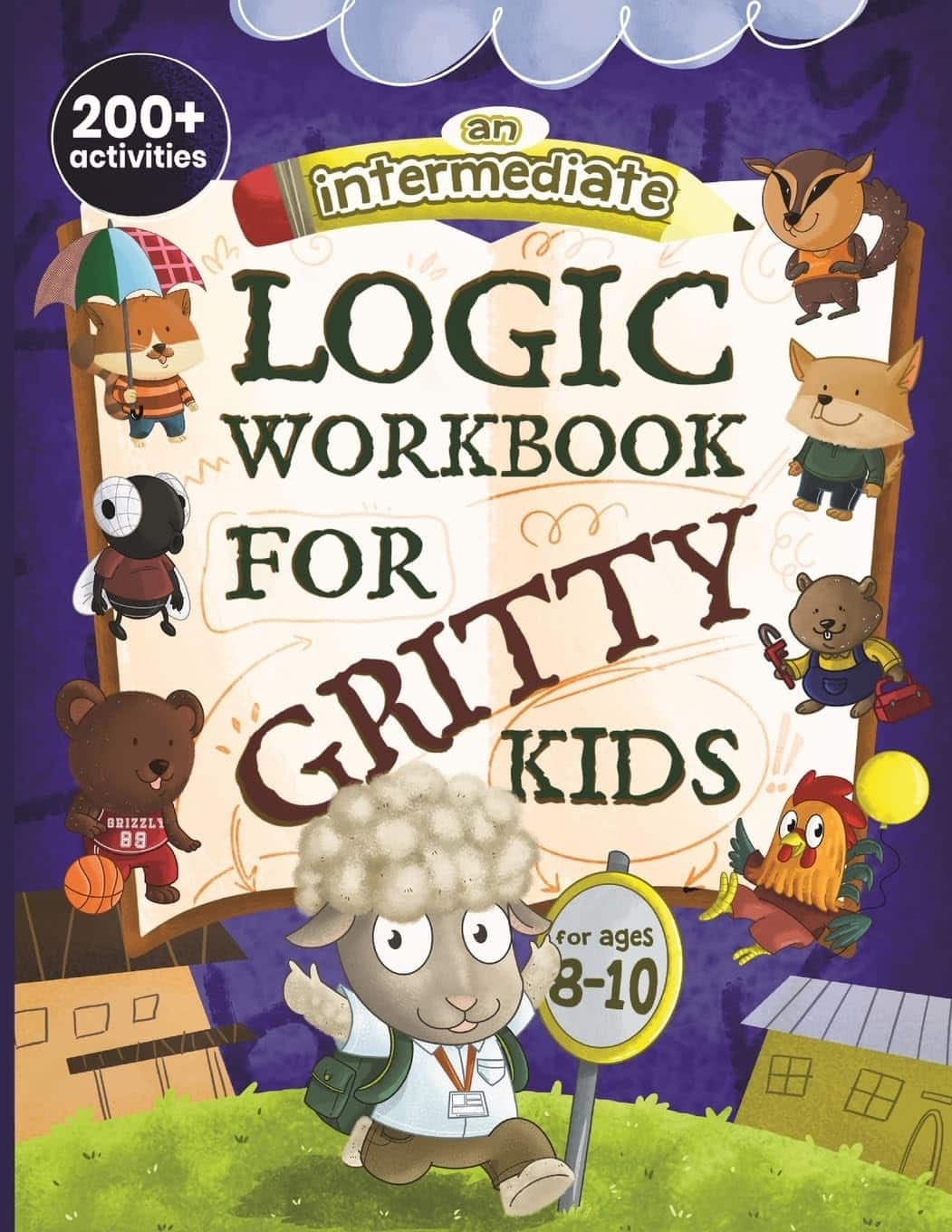
Indicate the Genre or General Subject Matter of the Book
Remember the analogy of the word-search and the horse. If your book is an activity book about space exploration, then make sure you’ve got stars, planets, a spaceship or two. Don’t put a funny vampire or a rainbow unicorn on the cover…unless they’re in spacesuits.
Follow the Leader
Look at best-selling examples of the kind of book you’re creating. If you’ve ever browsed a Hudson News kiosk at an airport, you know what the bookracks look like. They may all be different books about different topics and genres, but they all have one purpose: to sell themselves to the browser. Use BookBolt’s analytic tools to determine what books in your area of interest are selling best, then break down the elements of their cover designs (while not outright copying) and apply that geometry to your book design as well.
Look Professional
This is part of the previous tip to an extent, but this tip covers execution. Make sure your elements are all high-resolution, avoid default fonts, don’t leave watermarks on any stock imagery (which shouldn’t be there anyway of you actually paid for the image). If you’re going to bleed the cover art off the page, be sure not to crop it at the trim line. Similarly, make sure all your critical information is well within the safety area, which should be at least ¼” inside the trim line. In short, whether or not you are an amateur, don’t look like one.
Have a Distinct Style
Hopefully, this is not a one-and-done project for you, so you’ll want to create something that will make customers remember you the next time they’re looking for a similar book. Keep your cover geometry similar from one to the next. Use the same font for each title. Where applicable, use the exact same design, but change the color of the typography (and the title of course) or the color tone of the main image.
THE SPINE
My OCD loves a good set of book spines that line up like numbered collectibles on the shelf. That fact also is a selling point: books are not only informative and useful, but contribute to home décor. A lovely collection of books with complementary spines speaks volumes (sorry not sorry) about the reader.
Depending on the page count of your book, you may or may not have a lot of room to play with, so make sure your spine includes the basics:
- Title: at the top of the spine, largest font
- Author: close to, but not at the bottom
Imprint: (this would be your brand, which I encourage you to create so readers know you are serious about this as a going concern) all the way at the bottom
THE BACK COVER
The one advantage that online book listings have over in-person sales: you can read it from your arm’s length and still benefit from the 20-foot rule. You can’t do that in a bookstore unless you’re from Krypton (but then, you could always read the whole book through the cover, and Superman wouldn’t steal, would he?).
In person, the front cover pulls the customer over and then they have to flip the book over to read more if the front cover did its job. Online, it’s already visible as a small thumbnail and accessible at a click, so you can employ some of the front cover tips above to push the customer closer to the “add to cart” button. Just make sure to include the following:
- A short but catchy description of the book
- Any reviews you’ve received on previous efforts from customers or peers
- An author bio
- And of course, the ISBN/barcode (not necessary for marketing, but just a reminder)
Now you’re all set to create a book cover design so compelling that customers will be hooked, whether it’s at arm’s length or 20 feet away.