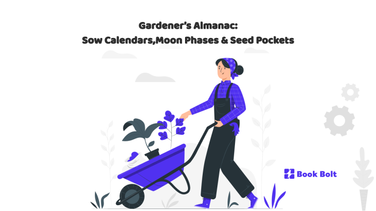
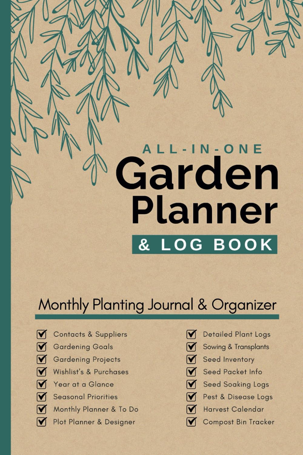
Seasonal trackers, zone maps, and notes sections—an aesthetic guide for planners that feel like the garden itself
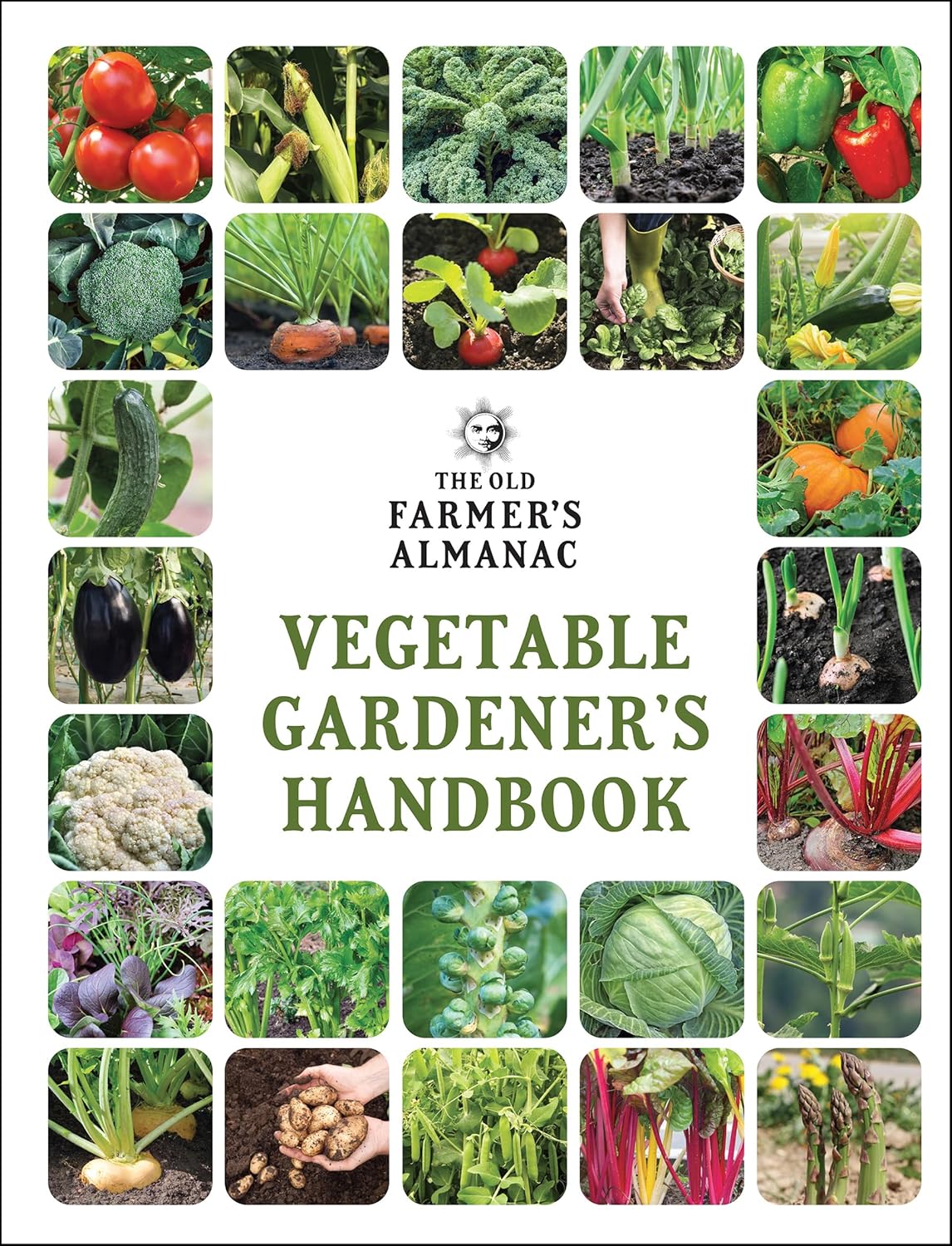
A gardener’s year is a slow circle: seed catalogs dog-eared in winter, first pots on a bright sill, spring rain on warm soil, tomato vines leaning into twine, and a final notebook tally of what loved the heat and what sulked in shade. The best gardener’s almanac doesn’t boss anyone around—it keeps time, remembers experiments, and offers a quiet place to plan. Think sow calendars, moon phase cues, and little seed pockets that rustle with possibility.
If you’re building a print-on-demand almanac for BookBolt readers, lean into choices that make the object feel heirloom-honest and easy to live with: botanical linework, linen neutrals, type that reads like a garden label, and pages that welcome pencil, smudges, and taped-in scraps. This is a mood board and field guide in one—less instruction manual, more studio visit.
The soul of a garden planner (and what it isn’t)
A gardener’s book isn’t a lab report. It’s wisdom captured in pencil, dirt fingerprints, quick sketches, and seed envelopes taped like postcards from the future. The tone is patient. Good pages give you time—time to note a sow window, track seasonal shifts, and record what actually happened.
What it isn’t: cluttered dashboards, complicated metrics, neon energy, or pages that turn a quiet task into homework. The almanac should feel like opening a drawer of neatly folded tea towels: simple, useful, beautiful.
The visual pantry
Even if you’ve never named the style, you’ve seen it:
- Classic herbals and almanacs with engraved plants and modest borders
- Family seed catalogs with restrained layouts and creamy paper tones
- Farm-stand signage: chalk-like lettering, pencil notes, tidy placards
- Field notebooks with dotted or gridded pages, weather scrawls, bed sketches
- Potting-shed materials: clay pots, twine, linen aprons, enamel mugs
Your design should echo those objects. It should smell faintly of soil, soap, and sun-warmed wood.
Type that feels like labels and ledgers
Garden literacy is practical. Let your typography feel like seed packets met a well-kept ledger:
- Headings: a warm serif that supports small caps (perfect for month names)
- Labels/tables: a neutral sans that stays crisp for dates and keys
- Numbers: tabular numerals in trackers; old-style numerals for charm in titles
- Language: friendly, non-scolding labels (“Sow Window,” “Notes from the Bed”)
Use one serif + one sans, then let white space do the heavy lifting.
Linework and icons with restraint
This is where charm lives: engraving-style botanical drawings with disciplined lines and plenty of white space. Keep motifs modest and consistent—like stamps:
- sprigs, blossoms, bees, ladybirds
- clean moon phase symbols
- simple weather icons (sun disc, rain lines, wind curl)
- dotted guides for sketching beds
Think “field guide margin,” not clip-art overload.
The annual shape
A gardener’s year can be mapped three ways, and the best almanacs quietly include all three:
- Circle: a Wheel of the Year for first frost, first bee, last tomato
- Ladder: month-by-month pages with sow windows and weather notes
- Bed: dedicated spreads for each bed/container as a “place-based” record
Design, not doctrine: a few strong devices beat a page-per-day approach.
Sow calendars that whisper
Sow calendars should suggest windows, not bark orders. Use clean crop rows with soft bands for “start indoors,” “harden off,” and “direct sow,” leaving room for the gardener to pencil in reality.
Small wins:
- dotted band edges to signal flexibility
- subtle grids that don’t compete with handwriting
- a blank template page for “Your Varieties + Notes”
The best calendar records what you planned and what you actually did.
Moon phases as calm cues
Whether or not readers plant by the moon, lunar rhythm belongs in a garden book. Treat it as a quiet repeating ornament with purpose: a simple strip of phases on monthly pages or tucked along sow calendars.
Keep it clean:
- tiny open circle for New Moon dates, solid disc for Full Moon
- one line for “Sleeper’s note” (many gardeners track rest as part of rhythm)
Mysticism is optional. Cycles are the point—plants, pests, and people all have them.
Seed pockets: function becomes romance
Seed pockets are where the almanac turns into a keepsake. Even if printed flat, they can feel tactile with careful design:
- a simple illustrated pocket panel with a “Tape packet here” cue
- small-cap labeling for Variety / Year / Source / Notes
- light texture suggestion (kraft/linen effect, very subtle)
These become memory drawers. People keep books that shelter little archives.
Seasonal trackers that feel like rituals
Keep trackers modest, repeatable, and satisfying to flip through in winter:
- Firsts & lasts: first crocus, first bee / last frost, last tomato
- Weather strip: a simple monthly line for sun/rain/wind/frost marks
- Pest & pollinator sightings: dates + quick notes
- Harvest tallies: crop, quantity, and an “!” column for joy
Ritual beats workload every time.
Zone maps: respectfully minimal
Most gardeners already know their zone. Your job is to acknowledge place without turning it into a lecture:
- single-ink contour style + tiny legend
- notes panel for microclimate, wind, shade, frost pockets, heat sinks
- a small balcony/rooftop inset with gentle prompts, not rules
Let the map be a mirror, not a manual.
Notes pages: the kitchen-table voice
Notes sections should welcome sketches and messy thinking. Use dotted grids with soft rules and rotating header tags:
- What worked / What didn’t
- Next time
- Wish list / seed lust
- Neighbors & swaps
One tiny quote per section is plenty (“Compost is forgiveness”). The pages belong to the gardener’s voice.
The monthly spread: a calm porch
Every month should open like a porch door: air, light, room to set the basket down.
- Month name in small caps with one modest botanical cue
- a short list of priority sow windows + room to annotate
- notes for weather quirks, pests, and small sightings
- a footer strip for moon cues + one or two seasonal maintenance reminders
Conversation starter, not scolding checklist.
Common missteps (and kinder fixes)
- Clip-art avalanche: edit down and repeat motifs with dignity
- Over-gridding: soften tables into open fields and dotted guides
- Mystical overreach: keep lunar cues simple; let gardeners decide meaning
- Micro-text: upsize labels, add breathing room, avoid hairline rules
The gardener should exhale when the book opens.
Why this aesthetic sells (and keeps selling)
It photographs beautifully, ages gracefully, fits every kind of gardener (balcony to backyard), and becomes sentimental once seed pockets and notes fill up. A gardener’s almanac succeeds when it feels like it belongs among trowels and twine—not just on a screen.
Design it quietly. Print it on paper that likes pencils. Give it sow calendars, moon phases, and places to tuck seed dreams. Then let the gardener make it theirs—one season at a time.