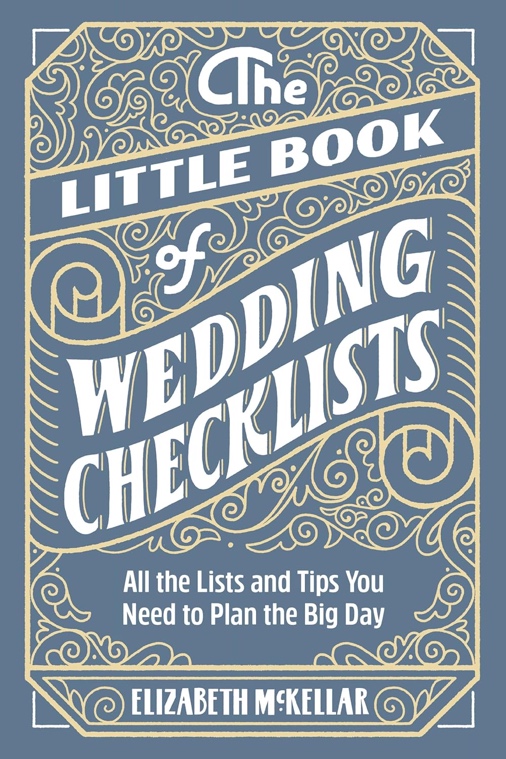
Vendor trackers, budget sheets, seating charts—A4/US Letter interiors that feel like heirlooms in the making
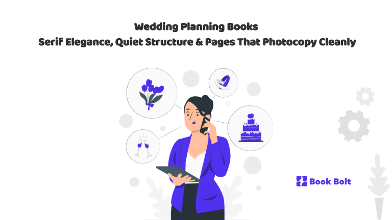
There’s a reason wedding planning always circles back to paper. Even with shared spreadsheets and group chats, the process becomes calmer when you can touch it: a book on the kitchen table holding a thousand tiny decisions—fabric notes, vendor quotes, timelines, and the little reminders that keep everything from drifting. If you’re designing a print-on-demand wedding planning book for KDP, your job is to make pages that behave like a trusted assistant and look like they belong beside the invitation suite. That means serif elegance, quiet wayfinding, and interiors sized in familiar formats—A4 and US Letter—so couples can photocopy any page they want to reuse without the design collapsing.
This is a design-forward tour of the aesthetic and the workflow: how to signal “timeless,” and how the core tools—vendor trackers, budgets, timelines, and seating charts—become a calm, beautiful system people keep long after the last sparkler goes out.
Why serif elegance works
Weddings live between tradition and taste. Stationery solved that long ago: classic serif typography paired with fine rules, generous margins, and subtle ornament creates timelessness with room for personality. Serifs do the etiquette work: they read cleanly, handle small caps and numerals beautifully, and bring a letterpress hush to headings.
For a planning book, the win is practical too. Couples need clear categories—Budget, Vendors, Timeline, Guests—so your page design should include strong section dividers, consistent page titles, and repeatable layouts that become muscle memory.
Page architecture: quiet structure that scales
Design for two truths: some couples plan minimally, others plan like producers. Pages should look composed when nearly empty and when heavily annotated.
- Generous margins (writing space is the luxury)
- Fine rules for tables, with a heavier rule for page titles
- Minimal icons (or none)
- White-space breaks between modules so pages don’t feel punitive
If decoration competes with handwriting, remove the decoration.
Wayfinding that feels premium (without tabs)
Instead of “binder” cues, use book-native navigation that still feels luxurious:
- Section opener pages with a calm title and one restrained motif
- Edge markers (small blocks or symbols near the outer margin) to find sections fast
- Consistent headers/footers (section name + page number) for easy flipping
- Optional: a Table of Contents and a “Key Pages” list (Day-Of, Payments, Vendor Contacts)
The essentials, elegantly
Vendor trackers (the working heart)
A wedding is a collaboration. Your vendor pages must be the most honest pages in the book: contact details, scope/style keywords, quote, retainer/balance due dates, and a roomy notes field for call summaries and “vibe” cues. Add a shortlist matrix so couples can compare A/B/C without toggling apps. A simple checklist (contract signed, retainer paid, COI, dietary notes, timeline shared) keeps details from slipping.
Budget (calm arithmetic)
Money pages often feel clinical. Yours should feel like forecasting a dinner—human, not cold. A master table with Estimated / Actual / Paid / Balance / Due Date / Notes covers the full picture. Add a chronological payment tracker with confirmation fields and a gentle reminder band for “three days prior” items people forget.
Timeline (a runway, not a stopwatch)
Build a reassuring ramp: 12–6 months → 6–3 → 3–1 → week-of → day-of. The day-of run sheet should be a clean two-column page (Time / Who-What) with buffer lines. Make “Day Of” easy to find via edge markers and the “Key Pages” list up front.
Guest list & RSVPs (manners meet logistics)
A master guest table (invite sent, RSVP, meal, allergies, table, thank-you sent) plus an address/thank-you tracker that can be reused after the wedding.
Seating charts (make it social, not geometric)
Offer a room overview sketch box and one page per table with seats and a soft meal key. Include both round and long-table layouts so couples choose what matches their venue—and can photocopy extra table pages as drafts change.
Ceremony & vows (reverence in the margins)
A simple ceremony order page plus wide-lined (or unruled) vow pages with a faint border and a “photocopy an extra page to sign and frame” note. This is where the book becomes a keepsake.
A4 and US Letter: sized for easy photocopying
Couples often want duplicates: multiple vendor call pages, extra table sheets, a second payment tracker, another day-of run sheet for the coordinator. Design so photocopies stay crisp and useful:
- Keep every worksheet single-page complete (not dependent on facing pages).
- Ensure table lines and labels hold up after repeated copying.
- Avoid ultra-light tints that vanish on office machines.
- Leave generous writing fields—people write bigger when stressed.
The goal: a book that can be reused, duplicated, and worked hard without losing its calm.
Build a series, not a one-off
Create a few “scenes” (moods) and keep the layout grammar consistent across all pages so every title in the line feels cohesive:
- Linen & Laurel (garden/estate)
- Blush & Brass (classic ballroom/city)
- Ink & Ivory (modern editorial)
- Sea Glass (coastal)
- Stone & Fig (autumn/library candlelight)
Same structure, different vibe—easy choice for shoppers, easy brand system for you.
Why couples keep the book
A good wedding planning book becomes an archive: vows, menus, timelines, and the notes that capture how it felt. When you design with serif calm and clear wayfinding—and you make pages that photocopy cleanly—you’re not making office forms. You’re making a temporary home for a love story.
Design for clarity. Let the structure support, the typography whisper, and the pages hold the season—then step back and let the couple write the book.