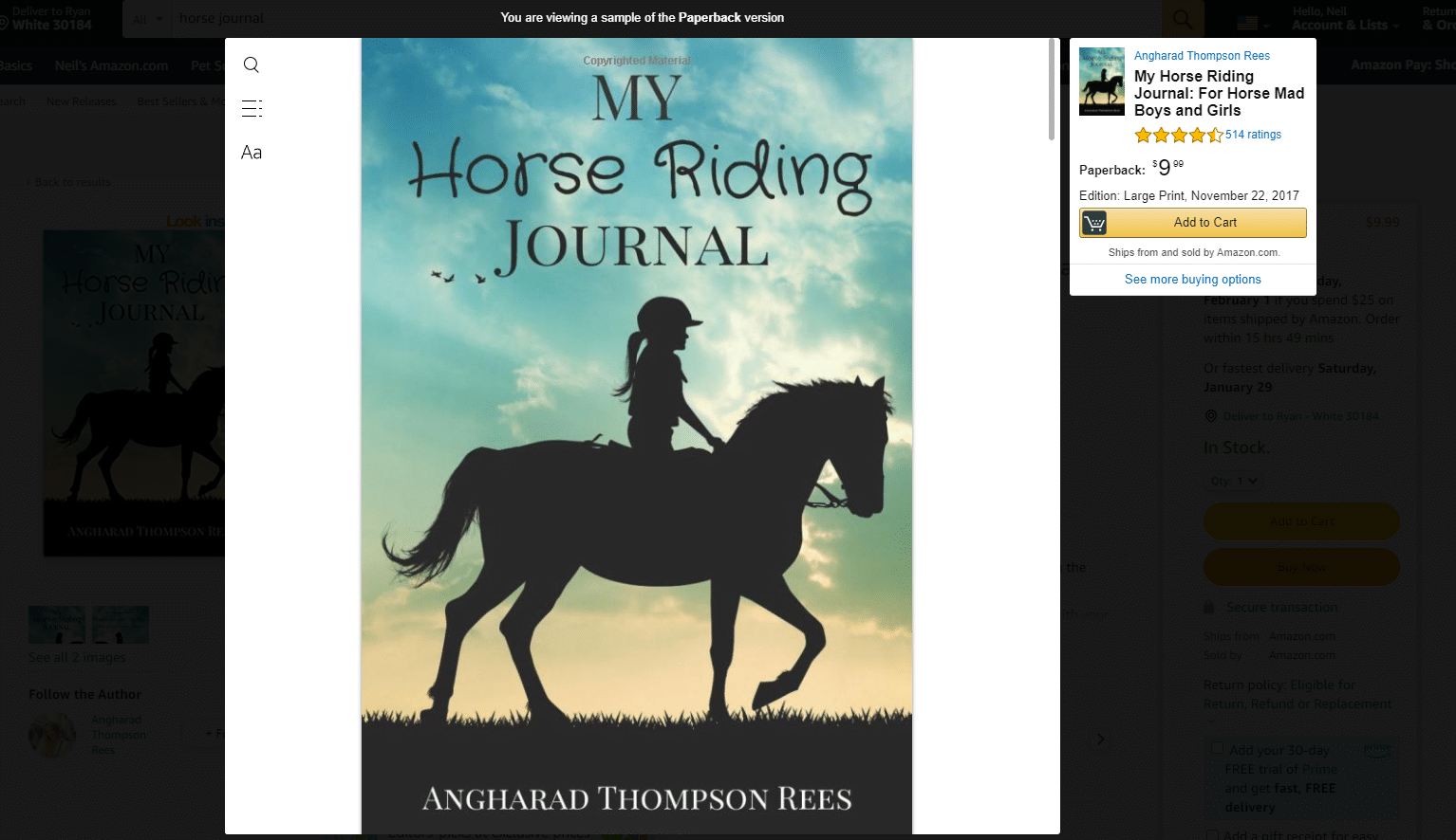
You already know that no-content books are those that, as the name implies, have practically no content in them. You won’t find any text, and at most, you’re likely to find some lines or even blank pages. Some examples of no-content books include blank, lined, and prompt journals, notebooks, adult coloring books, doodle books for kids, writing or composition books for kids, sketchbooks, blank sheet music, notepads, and diaries, amongst others.
What you probably also know is that your cover is either going to make or break your next sale. That’s why it’s often said that poor design will either minimize your sales or kill them completely. We’d like to think of it as a checkbox exercise. If you do it diligently, your cover will spark an interest and make more sales.
And so, we’ve prepared a 9-point checklist right here to make it easier for you.
Let’s begin.
-
Know Your Target Audience
The first step before you even get into designing your no-content book cover is to identify the target audience that you’ll be selling to. Will it be a whimsical teenage girl or a professional woman? Will you be selling to seniors with more conventional sensibilities or to someone who’s just starting college? Your audience breakdown will dictate your design. Remember that your design will end up being rather bland if you’re trying to sell to everyone. What’s more is that if the design is not talking to anyone specifically, it’s not talking to anyone at all. This is why you’ve got to stop and identify your target audience first before getting into designing the cover.
-
By-The-Book Cover Layout Or Composition
Poor layout or composition refers to where the main elements such as imagery and text are placed on the page cover. If you have simply plonked several images and texts on the page without specifically dealing with their ordering, this will yield a weak hierarchy. This is why you’ve got to ask yourself: what element do you want to stand out first, second, etc.? Remember that if all the elements are the same size, nothing will really stand out. What’s more is that your title and subtitle should not be the same size. Nor should you misalign certain objects such as a non-centered title. Other no-no’s include placing text over the top of really busy backgrounds, making it look almost illegible. Then there’s poor treatment of the back cover, which shouldn’t be ignored. It’s better to have a sense of continuity.
-
The Right Typography
Typography relates to the fonts you use. Sure, it’s easy to pick a simple font or randomly choose one to your liking from the millions of fonts out there, but remember that it’s not about you, it’s about your customers. This is why you need to spend some time choosing the right font for your no-content book. Also, bear in mind that you should choose fonts that match the style and audience you’re targeting. Some examples of low-quality fonts to avoid are those with kerning between the letters, making font choices that don’t work together, having legibility issues with fonts being too big or too small, and more.
A further problem you might wish to avoid is fonts that are badly drawn. A lower-case “g” may look fine and dandy online only for you to realize that it makes the text look blotchy or with so-called “flags” all over the place. Finally, there’s the issue of misalignment. Misalignment happens when the font doesn’t sit properly on the baseline. Alternatively, you may have “set width” errors where the letter spacing has not been calculated appropriately.
While the choice of font will ultimately depend on your no-content book’s main purpose and your target audience, there are a few rules to keep in mind. One thing is font size. Although this rule mainly applies to paperbacks, it could as easily be implemented in your no-content book cover. The rule is not to go below the font size of seven. Anything below that means your text risks being illegible.
-
If Your Phone Can Make 4K Videos, Your Cover Can Definitely Include High-Quality Pics
It’s easy to rely on cheap clipart or photography for your no-content book’s front cover. After all, most of the time it’s free, there are no copyright infringements, and you’re likely to get the design you want, albeit in a rather basic way. If you’re thinking this way, you need to stop right now. Choose high quality images and use clipart only if it will emphasize your cover’s main idea or style, while appealing to your audience. Also make sure that you don’t use an unappealing color palette with colors that clash, don’t match, are of similar value. Low resolution images that look pixelated are a big no.
-
Diversify Your Catalog
Lack of differentiation in your no-content book catalog could either mean that you’ve used background art that may have been swapped out but the typography is the same, or the reverse: using the same background that’s used on all the books in your catalog. This is problematic because you will end up with a wall of the same looking books with a bit of differentiation here and there. Surely, this will alienate your audience. While it’s okay to run along with a common theme across all your products, the lack of differentiation generally spells out pure laziness and low-quality books that are unlikely to sell.
-
Harmonize Your Images
Then there’s also the poor integration of multiple images. If you’re using Photoshop, it may be tempting to simply clump together a bunch of images in one go and say “hey presto, the design of the cover is done!” However, this is going to lead to audience confusion. Especially if you use too many images and if the images don’t really relate to one another. Aim for continuity and cohesiveness.
One way to illustrate this is by taking a cover of a gothic themed no-content book with two mages, a sword in the middle, a castle, and sky and grassy banks in the background. Counting these leads to approximately six elements on the cover. This is already quite busy.
Ask yourself whether each element is absolutely essential for you to get your point across. It might be worthwhile removing one of the mages and even the sword. If one mage will do just fine, or if the grassy banks don’t really add to the storyline, you better make some changes to your initial design.
-
Be Mindful Of Lighting Sources, Shades And Shadows
A crucial, but sometimes overlooked point, is lighting. Be careful of multiple images that have been differentiated by different light sources and weather conditions. Say you have a princess and the light on her head comes from the right. Then you have a castle in the background, and it’s covered in light from the left. Ultimately, this shadowing effect is quite easy to spot and shows that there’s not been proper analysis of your images and light sources, ultimately affecting the sense of continuity that a Seller would be going for.
-
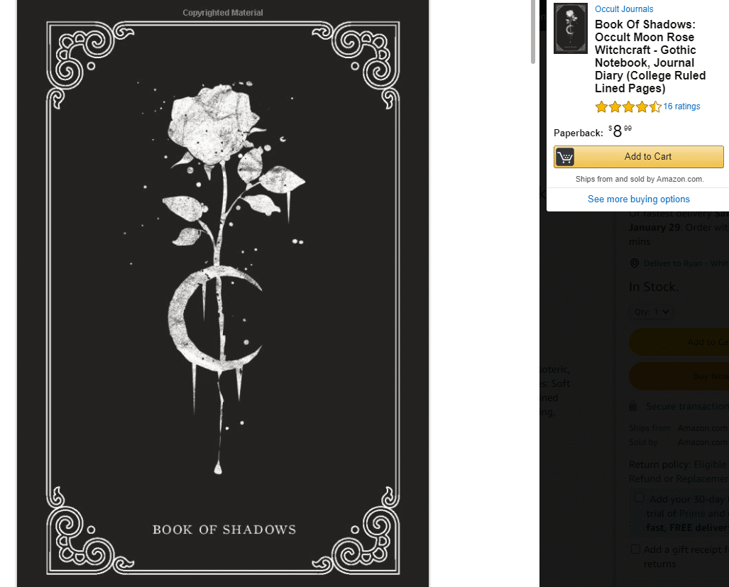
Apply A Uniform Color Scheme
Next up, you’ll want to be consistent with your color scheme. You do not want your fonts and text colors to be mismatched from the main elements on the cover. Aim for one color scheme that will help you stay uniform and consistent. Such consistency will help align elements better with each other. It will also add tremendous value to your no-content book by not making your readers’ eyes avert in disgust.
-
Be Clear About The Nature Of Your No-Content Book
Finally, there are some no-content books that have covers which simply do not tell the audience what the book is about. This can lead to a lot of confusion and definitely affect your sales. If it’s a planner or a diary, make sure to mention this specifically on your cover. Whatever type of no-content book you choose to sell, spell it out for your customers. This will help make the choice between your or a competitor’s no-content book that much easier.
Final Thoughts
Your no-content book’s cover is not going to be as effective without the implementation and consideration of the design elements mentioned here. To make the most of it, make sure to apply the various constituents we mentioned above to help make your no-content book’s cover as best and attractive as possible.
Good design is more likely to lead to more sales, while the opposite is also true. This is why it’s crucial to spend a good amount of time on the cover. Try to immerse yourself in its design, so that what you ultimately put out there will bring you the sales you’re after.